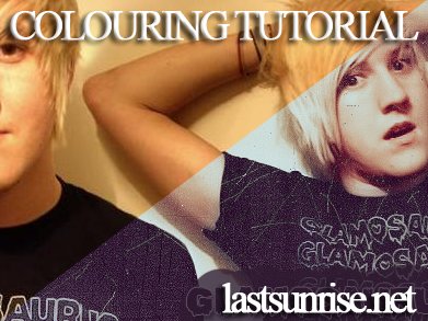
Tutorial
Click on thumbnailed images to enlarge
This tutorial will show you colouring with curves and selective colouring.
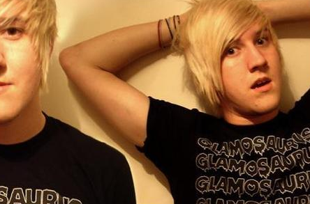
I'm going to use this image of Sean Smith:
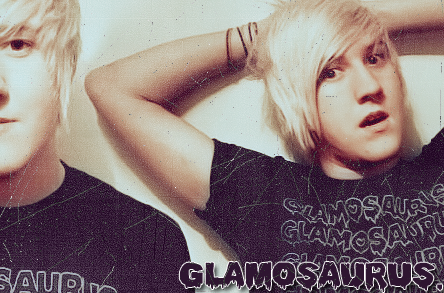
And we're going to turn that into this:
So let's do it.
Open your picture.
COLOUR
REMEMBER that all colour techniques work differently with each image: You have to play around to get what you're looking for.
This is what works with MY images, so you should know what you're doing to use this tutorial.
01 Touching up;
First thing that I've got to do is DE-YELLOW my image.
Then I'm going to sharpen it up.
I normally use these kind of settings, making sure my brush is the right size to fit the eyes, or whatever you're sharpening.
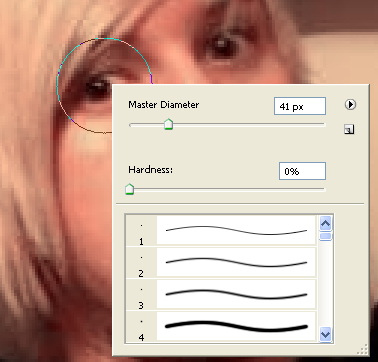
I also sharpened up Sean's nose and lips, as well as the edges of his hair and the detail on his shirt.
I'm going to use the quick mask tool to select the face,
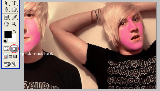
I then take it back to normal mode, Select > Inverse, and feather by about 5 pixels, but up to 20px depending on the size of your image.
CTRL+J to duplicate this,
And then Filter > Blur > Gaussian Blur. About 2 pixels,
I then get this:
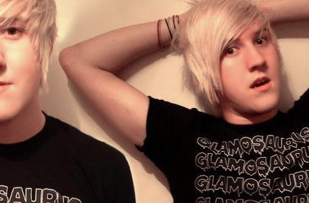
Which as you can see, looks plastic.
If you take the opactiy down to about 60%, then you get some of the texture show through, so it doesn't look awfully fake,
But you still get smoother skin, with less noise & pixels.
Okayy, back to your bottom layer.
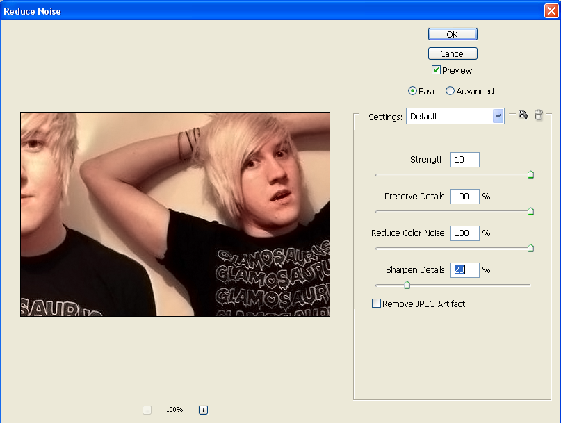
And go Filter > Noise > Reduce Noise
With these settings;
One final Filter > Sharpen > Sharpen, and you've got a [i]hopefully better looking image.
MERGE YOUR LAYERS(:
02 Curves 1; soften and bring out range in colours.
This set of Curves is my favourite at the moment, and it works with almost any picture. Every picture that I've tried, anyway.
You want these kind of settings.
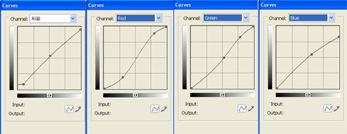
I'm not going to go through specifics because you should play with them anyway.
Just choose which looks best with your image.
REMEMBER. If you like your curves SAVE THEM so you can use them again!
It makes everything so much easier.
This is what my image looks like so far:
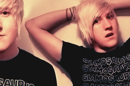
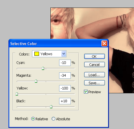
I took my yellows down again using Image> > Adjustments > Selective Colour.
03 Curves 2; more colour.
I like this set of curves because they make things seem a bit more... spooky looking, I suppose.
You want these kind of settings.
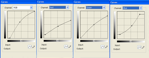
Again, no specifics.
And again, work with it.
AND AGAIN. Save you're favourite curves!
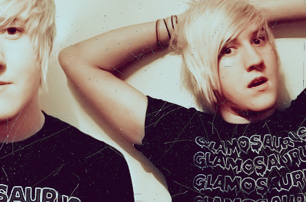
This is what Sean looks like so far:

04 Textures & brushes.
For this I wanted a more grungy feel, whilst not going full grunge.
I used these two Textures;
texture one & texture two
Set the black one to LIGHTEN and the white one to DARKEN. This makes sure that the texture isn't limited to just dark or light tones.
This is what Sean looks like now:
I then used THESE brushes.
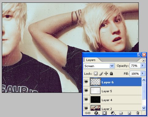
I set my colour to a middle grey, and set the layer to screen,
As well as turning to opactity down to about 70.
I then added text(:
You can do the same, or leave it.
You now have your final product. Save For Web > Save as PNG for best quality, especially if you have used text.
credits;
-digitalrevolutions.deviantart.com
-I don't know exactly where my textures were from, but swimchick.net provides some great textures.
-dafont.com for the font: darah erc
I'm going to use this image of Sean Smith:
And we're going to turn that into this:
So let's do it.
Open your picture.
COLOUR
REMEMBER that all colour techniques work differently with each image: You have to play around to get what you're looking for.
This is what works with MY images, so you should know what you're doing to use this tutorial.
01 Touching up;
First thing that I've got to do is DE-YELLOW my image.
Then I'm going to sharpen it up.
I normally use these kind of settings, making sure my brush is the right size to fit the eyes, or whatever you're sharpening.
I also sharpened up Sean's nose and lips, as well as the edges of his hair and the detail on his shirt.
I'm going to use the quick mask tool to select the face,
I then take it back to normal mode, Select > Inverse, and feather by about 5 pixels, but up to 20px depending on the size of your image.
CTRL+J to duplicate this,
And then Filter > Blur > Gaussian Blur. About 2 pixels,
I then get this:
Which as you can see, looks plastic.
If you take the opactiy down to about 60%, then you get some of the texture show through, so it doesn't look awfully fake,
But you still get smoother skin, with less noise & pixels.
Okayy, back to your bottom layer.
And go Filter > Noise > Reduce Noise
With these settings;
One final Filter > Sharpen > Sharpen, and you've got a [i]hopefully better looking image.
MERGE YOUR LAYERS(:
02 Curves 1; soften and bring out range in colours.
This set of Curves is my favourite at the moment, and it works with almost any picture. Every picture that I've tried, anyway.
You want these kind of settings.
I'm not going to go through specifics because you should play with them anyway.
Just choose which looks best with your image.
REMEMBER. If you like your curves SAVE THEM so you can use them again!
It makes everything so much easier.
This is what my image looks like so far:
I took my yellows down again using Image> > Adjustments > Selective Colour.
03 Curves 2; more colour.
I like this set of curves because they make things seem a bit more... spooky looking, I suppose.
You want these kind of settings.
Again, no specifics.
And again, work with it.
AND AGAIN. Save you're favourite curves!
This is what Sean looks like so far:
04 Textures & brushes.
For this I wanted a more grungy feel, whilst not going full grunge.
I used these two Textures;
texture one & texture two
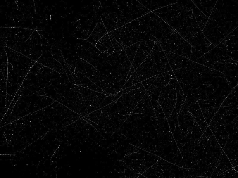
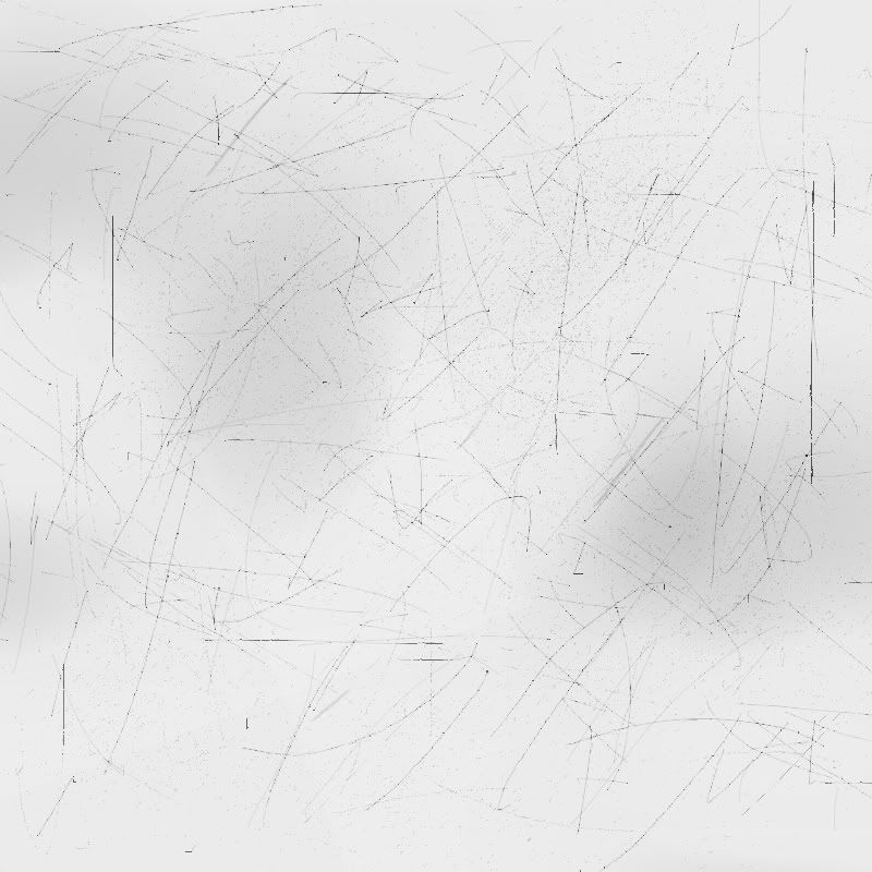
Set the black one to LIGHTEN and the white one to DARKEN. This makes sure that the texture isn't limited to just dark or light tones.
This is what Sean looks like now:
I then used THESE brushes.
I set my colour to a middle grey, and set the layer to screen,
As well as turning to opactity down to about 70.
I then added text(:
You can do the same, or leave it.
You now have your final product. Save For Web > Save as PNG for best quality, especially if you have used text.
credits;
-digitalrevolutions.deviantart.com
-I don't know exactly where my textures were from, but swimchick.net provides some great textures.
-dafont.com for the font: darah erc
Tutorial Comments
Showing latest 2 of 2 comments

I don't normally like grunge effects, but this is subtle enough. I love it. (:,'
By PaigeTurner on Jul 12, 2009 2:58 am
sweet (:
By forgetit on Jun 12, 2009 6:48 pm
Tutorial Details
| Author |
aliiicimo
|
| Submitted on | May 30, 2009 |
| Page views | 10,134 |
| Favorites | 31 |
| Comments | 2 |
| Reviewer |
manny-the-dino
|
| Approved on | Jun 1, 2009 |