Tutorial
Click on thumbnailed images to enlarge
This tutorial will show you colour with a more feminine image.
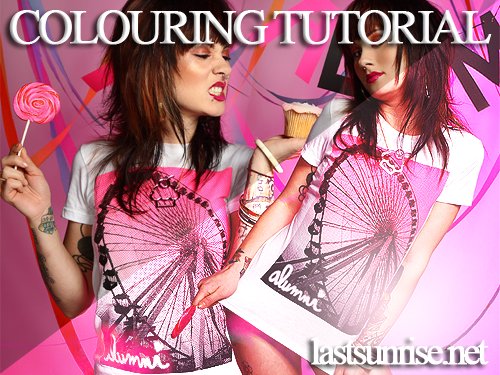
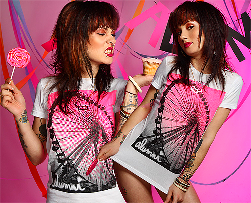
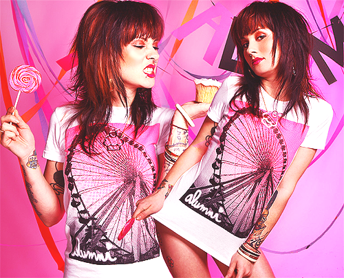
I'm using this blend I chucked together of a clothing line model:
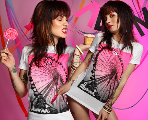
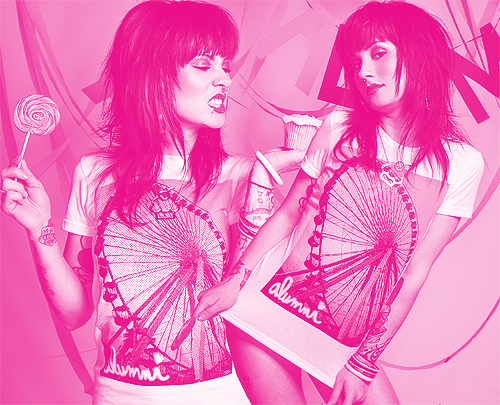
And we're going to turn that into this:
So let's do it.
Open your picture.
REMEMBER that all colour techniques work differently with each image: You have to play around to get what you're looking for.
This is what works with MY images, so you should know what you're doing to use this tutorial.
01 Touching up;
The first thing I always do is SHARPEN.
You can either use Filter > Sharpen > Sharpen, which I did for mine first off.
This works best if you've got a slightly blurring image, especially if you've resized it.
It also works well if you have detail in the shirt, and hair with feathered edges.
If this doesn't work, manually sharpen it up.
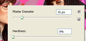
I normally use these kind of settings, making sure my brush is the right size to fit the eyes, or whatever you're sharpening.
I also sharpened up her eyes some more, and then her tattoos, and the feathered edges of her hair, which always generally improves quality.
I slightly blurred out some shine on her cheekbone, as I felt it looked odd.
LAYERS > New Adjusment Layer > Hue/Saturation.
For this, I pulled the Saturation up to about +18.
This worked for my image, as the colours were bright, but her skin wasn't so much.
This is what I have after tocuhing up my image:
02 Gradient Map 1;
Okay, go Layers > New Adjusment Layer > Gradient Map.
Now go to the simple gradients:
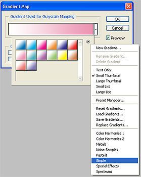
Choose the colour most prominant in your image. Mine is obviously pink.
I chose to use the hot pink, but the lighter pink comes out with the same qualities, just softer.
Once you have your gradient selected, you'll need to click reverse.
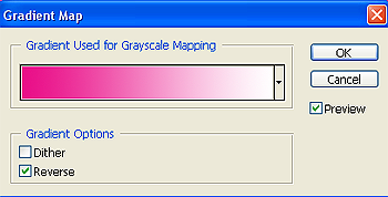
You should get something like this:
Finally, set this layer to OVERLAY on about 50% opacity:
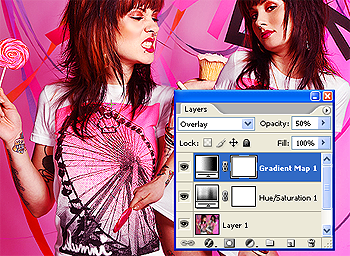
You'll now have a brighter image that is better quality, with some funky colours.
03 Curves 1;.
Another New Adjusment Layer > Curves.
These curves are simply to make you images look more suitable to what you want from your graphics.
I used just the RGB channel, as this works with the overall image.
Input:0
Output:31
Input:223
Output:255
This made my image brighter, as well as taking down the darker tones.
This is what my image now looks like:
04 Brushes;
I wanted to keep my image as simple as possible brushes wise because the background of the image is already quite busy.
I suggest if you have a busy background, you either cut it out and use brushes behind your subject, or you keep brushes minimal too.
For mine, I picked a light pink colour (specifically, #ffd2e1) and using the basic brushes, at about 260 size, 0 hardness, I placed two pink spots on my image, on a new layer set to screen.
I would recommend doing all brush work on a NEW LAYER as if you don't like it you can always undo it, and you also can change the percentage opacity, and blending mode, AND add blending options.
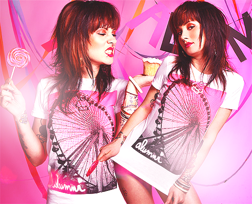
This is what my Model looks like now:
You now have your final product. Save For Web > Save as PNG for best quality, especially if you have used text.
I'm using this blend I chucked together of a clothing line model:
And we're going to turn that into this:
So let's do it.
Open your picture.
REMEMBER that all colour techniques work differently with each image: You have to play around to get what you're looking for.
This is what works with MY images, so you should know what you're doing to use this tutorial.
01 Touching up;
The first thing I always do is SHARPEN.
You can either use Filter > Sharpen > Sharpen, which I did for mine first off.
This works best if you've got a slightly blurring image, especially if you've resized it.
It also works well if you have detail in the shirt, and hair with feathered edges.
If this doesn't work, manually sharpen it up.
I normally use these kind of settings, making sure my brush is the right size to fit the eyes, or whatever you're sharpening.
I also sharpened up her eyes some more, and then her tattoos, and the feathered edges of her hair, which always generally improves quality.
I slightly blurred out some shine on her cheekbone, as I felt it looked odd.
LAYERS > New Adjusment Layer > Hue/Saturation.
For this, I pulled the Saturation up to about +18.
This worked for my image, as the colours were bright, but her skin wasn't so much.
This is what I have after tocuhing up my image:
02 Gradient Map 1;
Okay, go Layers > New Adjusment Layer > Gradient Map.
Now go to the simple gradients:
Choose the colour most prominant in your image. Mine is obviously pink.
I chose to use the hot pink, but the lighter pink comes out with the same qualities, just softer.
Once you have your gradient selected, you'll need to click reverse.
You should get something like this:
Finally, set this layer to OVERLAY on about 50% opacity:
You'll now have a brighter image that is better quality, with some funky colours.
03 Curves 1;.
Another New Adjusment Layer > Curves.
These curves are simply to make you images look more suitable to what you want from your graphics.
I used just the RGB channel, as this works with the overall image.
Input:0
Output:31
Input:223
Output:255
This made my image brighter, as well as taking down the darker tones.
This is what my image now looks like:
04 Brushes;
I wanted to keep my image as simple as possible brushes wise because the background of the image is already quite busy.
I suggest if you have a busy background, you either cut it out and use brushes behind your subject, or you keep brushes minimal too.
For mine, I picked a light pink colour (specifically, #ffd2e1) and using the basic brushes, at about 260 size, 0 hardness, I placed two pink spots on my image, on a new layer set to screen.
I would recommend doing all brush work on a NEW LAYER as if you don't like it you can always undo it, and you also can change the percentage opacity, and blending mode, AND add blending options.
This is what my Model looks like now:
You now have your final product. Save For Web > Save as PNG for best quality, especially if you have used text.
Tutorial Comments
Showing latest 8 of 8 comments

this is really cuteee girl (:
thanksss. love the picture also.
By georgejetKins on Jun 12, 2010 9:36 am

UuUuUu, i like thisss :]
By BiennChulaaxO on Jan 18, 2010 12:28 pm

kudos!
By futura on Jun 29, 2009 6:51 pm
great
By forgetit on Jun 12, 2009 2:48 pm

i love it
By LADiiSOULJA3 on Jun 11, 2009 8:23 pm

sweet and simple. nice.
By aimegracen on Jun 3, 2009 7:28 pm

Sweet coloring. ;D
By so-sarcastic on Jun 2, 2009 9:01 pm

this is really good :]
By elizabethsykes on Jun 2, 2009 9:41 am
Tutorial Details
| Author |
aliiicimo
|
| Submitted on | May 30, 2009 |
| Page views | 13,210 |
| Favorites | 69 |
| Comments | 8 |
| Reviewer |
manny-the-dino
|
| Approved on | Jun 1, 2009 |