Tutorial
Click on thumbnailed images to enlarge
This was made in Photoshop CS4, and I'll be honest, I highly doubt there's a difference between this one and other photoshop CS's, but if it's an older version of photoshop I honestly am now sure how well this will work. But, like anything else, follow the tutorial and apply your own settings. These are just guides to get you started.
Everyone all set? Well, lets get to it!
For this I will be using a picture of Matthew Bellamy from Muse. As you can already tell, the photo doesn't have the best quality and looks pretty dull if you ask me:

So, what you're going to do first (if you're using this picture or something similar) is sharpen it. If your picture is of decent quality, don't bother.
Now, onto the real steps of the tutorial.
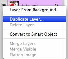
1. Duplicate your background layer.
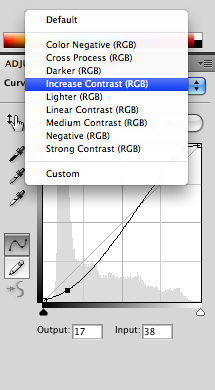
2. Go onto to Layer>New Adjustment Layer>Curves, apply these settings, and set to "Increase Contrast":
OUTPUT: 231
INPUT: 212
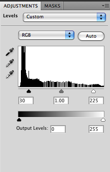
3. Now, go to Layer>New Adjustment Layer>Levels and apply these settings:
RGB: 30, 1.00, 225
4. Flatten image.

Now, you're going to duplicate your background image once again so we can add the final color adjustments. This is what you should have so far (considering you're using this picture, if not something close to this):
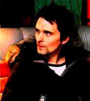
It looks a tad better, but is still rather dull. Now, we're going to add the rest of the color altering and saturation.
5. Go to Image>Adjustments>Color Balance and apply these settings. MAKE SURE THEY ARE IN THE CORRECT SECTION:
MIDTONES: -83, +20, +49
SHADOWS: +23, 0, +14
HIGHLIGHTS: -35, -21, +17
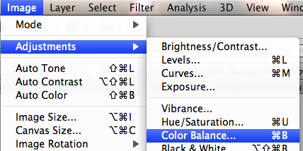
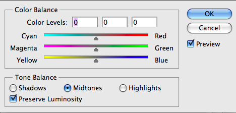
In this one I didn't supply the settings, I just wanted to show an example of what I mean by using the correct settings.
6. Now it's time to add the saturation. Go to Layer>Mew Adjustment Layer>Hue/Saturation, apply these settings, and set to "Increase Saturation More" (optional):
MASTER: 0, +30, 0
CYANS: 0, +57, +52
BLUES: 0, +43, +25
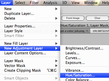
7. Again flatten the image, but now you're completely done. Here's what the final product should look like (or something along the lines of it):
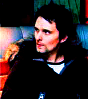
And this is what it would look like as an avatar:
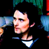
I really don't see any purpose in adding textures or brushes, but it depends on your image. If you want to, go right ahead, like I said in the beginning this is really just a guide to follow along with. Enjoy your creation. =D
Everyone all set? Well, lets get to it!
For this I will be using a picture of Matthew Bellamy from Muse. As you can already tell, the photo doesn't have the best quality and looks pretty dull if you ask me:

So, what you're going to do first (if you're using this picture or something similar) is sharpen it. If your picture is of decent quality, don't bother.
Now, onto the real steps of the tutorial.
1. Duplicate your background layer.

2. Go onto to Layer>New Adjustment Layer>Curves, apply these settings, and set to "Increase Contrast":
OUTPUT: 231
INPUT: 212

3. Now, go to Layer>New Adjustment Layer>Levels and apply these settings:
RGB: 30, 1.00, 225

4. Flatten image.

Now, you're going to duplicate your background image once again so we can add the final color adjustments. This is what you should have so far (considering you're using this picture, if not something close to this):

It looks a tad better, but is still rather dull. Now, we're going to add the rest of the color altering and saturation.
5. Go to Image>Adjustments>Color Balance and apply these settings. MAKE SURE THEY ARE IN THE CORRECT SECTION:
MIDTONES: -83, +20, +49
SHADOWS: +23, 0, +14
HIGHLIGHTS: -35, -21, +17


In this one I didn't supply the settings, I just wanted to show an example of what I mean by using the correct settings.
6. Now it's time to add the saturation. Go to Layer>Mew Adjustment Layer>Hue/Saturation, apply these settings, and set to "Increase Saturation More" (optional):
MASTER: 0, +30, 0
CYANS: 0, +57, +52
BLUES: 0, +43, +25

7. Again flatten the image, but now you're completely done. Here's what the final product should look like (or something along the lines of it):

And this is what it would look like as an avatar:

I really don't see any purpose in adding textures or brushes, but it depends on your image. If you want to, go right ahead, like I said in the beginning this is really just a guide to follow along with. Enjoy your creation. =D
Tutorial Comments
Showing latest 2 of 2 comments

Yes, the icon cropping made the low quality image compress.
I love the colors in this image! Although, I think the saturation should be lowered down a tad bit.
By creole on Apr 23, 2009 7:35 am
i like this. the low quality of the image is still apparent, but it's far less than what it was. cool. (:
By futura on Apr 23, 2009 2:24 am
Tutorial Details
| Author |
xpwoppa
|
| Submitted on | Apr 21, 2009 |
| Page views | 4,237 |
| Favorites | 8 |
| Comments | 2 |
| Reviewer |
manny-the-dino
|
| Approved on | Apr 22, 2009 |
