Songs We Sing~ (comments)
Displaying 1 - 12 of 12 comments

I love this layout and I've been attempting to use it for my myspace profile for a minute, but I can't figure out how to make the links work for my pictures and such. I put my friendid in where the XXXX's are, but it freaks out and changes it to random letters. Help....


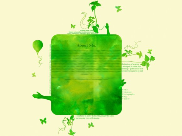
i would have liked the credit on the bottom rather than the top. i love the colour you used though (:

this is a very nice layout, but i didn't notice the navigation at first. it kind of just blends with the other words. i agree with the text being a bit too dark, too.

It's a bit plain for me and the text is kind of hard to read in the content area. Also, something about the colors just doesn't really fit in...kind of like there clasing. But it's different and different is good. :) Great job.

Very beautiful =D
Plan on making more with different colors?
^^;


the navigation is really hard to see...other then that nice job.
Add Comment
You must be logged in to comment
Layout Details
| Designer |
hollysetherfriendsonfire
|
| Submitted on | Apr 29, 2009 |
| Page views | 15345 |
| Favorites | 134 |
| Comments | 12 |
| Reviewer |
manny-the-dino
|
| Approved on | Apr 29, 2009 |