Designer's Comments
Look carefully for specific instructions
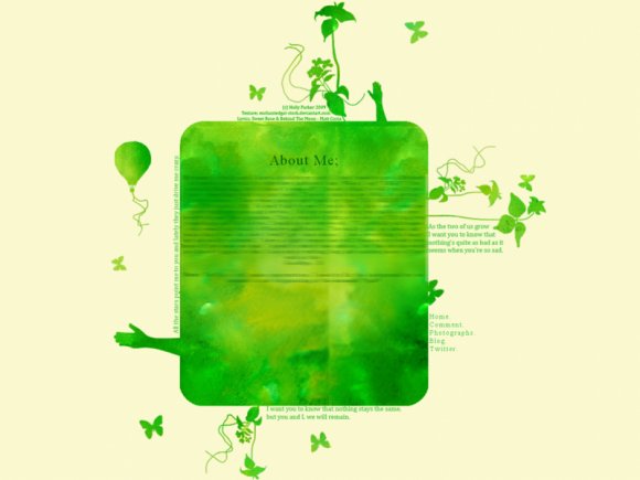
It's simple yes, but I there's something about it that I enjoy.
I'm guessing that it's all to do with the Matt Costa references.
The image is based on the album cover for 'Songs We Sing' by Matt Costa.
I take no credit for the lyrics -all his- and the texture.
I pretty much drew out the shapes and colored. :)
'XXXXXX' = FriendID
It's pretty easy to work out. ;)
Well, it's not my best, but I like it.
I hope you do too.
:D
Using This Layout
For specific instructions read designer's comments
- This is a div overlay layout, html knowledge required!
- 1. Log into myspace.com
- 2. Click on Edit Profile (Profile 1.0)
- 3. Copy (ctrl c) and paste (ctrl v) code to the specified fields
Layout Comments
Showing latest 10 of 12 comments

So cute.
But, it won't show my about me section? Hm.
I love this layout and I've been attempting to use it for my myspace profile for a minute, but I can't figure out how to make the links work for my pictures and such. I put my friendid in where the XXXX's are, but it freaks out and changes it to random letters. Help....

i love this :)

i agree with Janette. i love the green.

looks pretty neat.
but i second with what elletricity said.

Interesting.

i would have liked the credit on the bottom rather than the top. i love the colour you used though (:

this is a very nice layout, but i didn't notice the navigation at first. it kind of just blends with the other words. i agree with the text being a bit too dark, too.

It's a bit plain for me and the text is kind of hard to read in the content area. Also, something about the colors just doesn't really fit in...kind of like there clasing. But it's different and different is good. :) Great job.

Very beautiful =D
Plan on making more with different colors?
^^;
Layout Details
| Designer |
hollysetherfriendsonfire
|
| Submitted on | Apr 29, 2009 |
| Page views | 15,361 |
| Favorites | 134 |
| Comments | 12 |
| Reviewer |
manny-the-dino
|
| Approved on | Apr 30, 2009 |