Designer's Comments
Look carefully for specific instructions
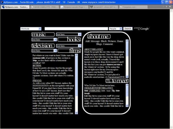
Please read everything in the layout - it'll help. And tbh, I've rambled a bit.
So, basically, all you need to do is edit the bits where I've written, replace the XXXXXX's with your Friend ID and if you want to add an extra drop-down, just copy the one before it and edit the text.
(I don't know why I had to ramble on the layout... padding it out I guess?!)
But yeahh. =]
Using This Layout
For specific instructions read designer's comments
- This is a div overlay layout, html knowledge required!
- 1. Log into myspace.com
- 2. Click on Edit Profile (Profile 1.0)
- 3. Copy (ctrl c) and paste (ctrl v) code to the specified fields
Layout Comments
Showing latest 10 of 22 comments

HELP! okay the navigation bar is still there but when i use a script to take it off, the navigation in the scroll box goes away, HALP MEH D: xD
u can find it on scrpipts and hide music player i hate layouts dat hides music players ppl who sees my profile cant watch the videos lol
this certainly do look fimilar how are you making thesee there nice i love this one =D
music player? i want to hide it, but i still wanna hear the music?
myspace.com/fake_ray ofsunshineKC

i think the section titles should have some color to it.

PLAIN BUT KOOL :D
How do you get the Music Player back?
cute!! i love plain!!

I love how this is organized :) A bit squished, but I guess if it was less crowded it would lose the effect. I don't like Times New Roman used in layouts- looks too school-ish and boring for my tastes. But I overall like it.

structured nicely. too plain. if it's minimal, then it should be simple and not plain. add a simple background. i don't like how there's a border around the headers.
Layout Details
| Designer |
PaintMyFace
|
| Submitted on | Jan 12, 2008 |
| Page views | 57,246 |
| Favorites | 345 |
| Comments | 22 |
| Reviewer |
S-Majere
|
| Approved on | Jan 12, 2008 |