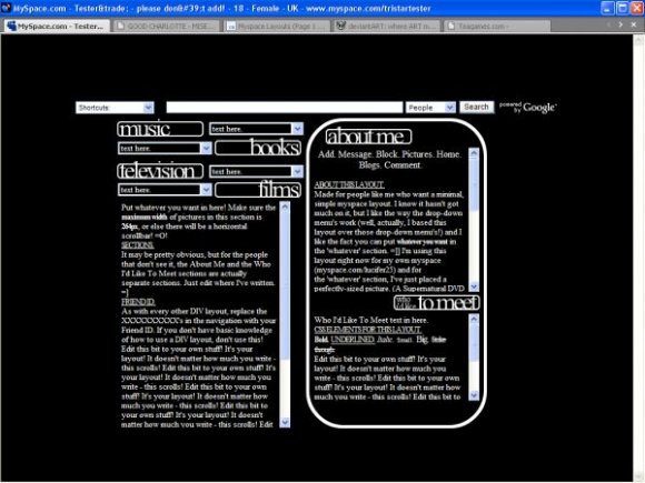
Minimal - b&w. (comments)
Displaying 1 - 20 of 22 comments

HELP! okay the navigation bar is still there but when i use a script to take it off, the navigation in the scroll box goes away, HALP MEH D: xD
u can find it on scrpipts and hide music player i hate layouts dat hides music players ppl who sees my profile cant watch the videos lol
this certainly do look fimilar how are you making thesee there nice i love this one =D
music player? i want to hide it, but i still wanna hear the music?
myspace.com/fake_ray ofsunshineKC

i think the section titles should have some color to it.


I love how this is organized :) A bit squished, but I guess if it was less crowded it would lose the effect. I don't like Times New Roman used in layouts- looks too school-ish and boring for my tastes. But I overall like it.

structured nicely. too plain. if it's minimal, then it should be simple and not plain. add a simple background. i don't like how there's a border around the headers.

it does have too much space to write, but I love the drop down things.it looks good.

I really like this one! I used it, but its complicated since there are cdes for the scrollbar and etc. by about me section didnt work so i had to put it in bold.
but maybe something was wrong with the coding that i added in.

The layout has sooo much space for users to write about themselves, but I find this new design/style to be a bit cluttered. Nice work though and I love that you tried something different.
I like the right table's rounded corners.
Not as keen about the headers' font sizes, though.
It's a unique layout, and I like it overall. :)

not keen on the font and the font sizing but other than that i like it.
It doesn't have to look cramped... the less you put in it the less it looks cramped. It only looks cramped because I wrote so much... =/

I actually like the whole clustered look of this. And I do like how the interest section is set up, with all fo the drop-downs. I think a better idea would have been to make a regular square border around the DIVs (instead of the rounded one).

i think im the only one that likes the cramped-ness about it.

ehh the drop downs are pretty cool but its a bit to crowded for me but im not a big fan of plain layouts anyhow
still pretty cool though :D

Everything seemed to cluttered even though its suppose to be plain.
Add Comment
You must be logged in to comment
Layout Details
| Designer |
PaintMyFace

|
| Submitted on | Jan 12, 2008 |
| Page views | 57299 |
| Favorites | 345 |
| Comments | 22 |
| Reviewer |
S-Majere
|
| Approved on | Jan 12, 2008 |