Website |
Resource Center Links
This Month's Contests | Hosts Looking for Hostees | Hostees looking for Hosts | BigBookofResources
Submission Guidelines
  |

 Aug 5 2010, 05:16 PM Aug 5 2010, 05:16 PM
Post
#1
|
|
 Sniff, sniff, hooray!  Group: Member Posts: 71 Joined: Mar 2006 Member No: 388,396 |
|
|
|
|


|
Aug 5 2010, 05:37 PM
Post
#2
|
|
|
Senior Member Group: Staff Alumni Posts: 4,665 Joined: Aug 2008 Member No: 676,364 |
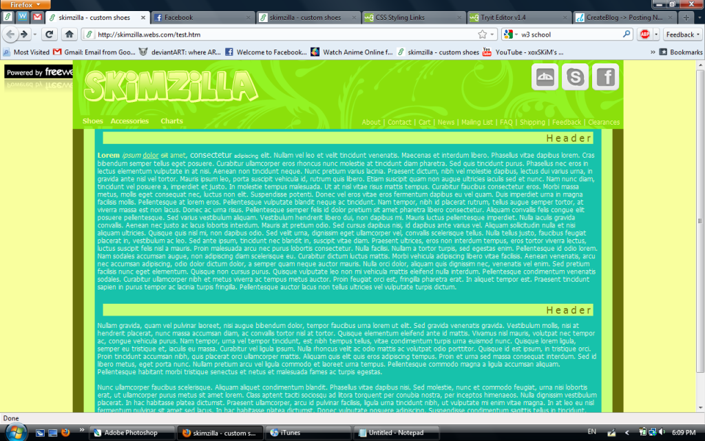
The only thing I'm not digging is the banner. It just doesn't look right with the table content below it.. Everything else looks great. I think changing banner color to brown might help to match with the other brown that connects?
|
|
|
|


|
Aug 5 2010, 05:40 PM
Post
#3
|
|
 Senior Member Group: Administrator Posts: 8,629 Joined: Jan 2007 Member No: 498,468 |
Too many bright colors plus they don't really match.
|
|
|
|

|
Aug 5 2010, 05:45 PM
Post
#4
|
|
 I'm Jc Group: Mentor Posts: 13,619 Joined: Jul 2006 Member No: 437,556 |
not a fan of the colors
also not a fan of the text. it's too much. by too much i been too long. it's not legible to read text in really long stretched out sentences like that. that's why people use columns. text columns would not only make it more readable but also give more structure. |
|
|
|


|
Aug 5 2010, 06:19 PM
Post
#5
|
|
|
Sniff, sniff, hooray! Group: Member Posts: 71 Joined: Mar 2006 Member No: 388,396 |
QUOTE(Cum @ Aug 5 2010, 06:37 PM)  The only thing I'm not digging is the banner. It just doesn't look right with the table content below it.. Everything else looks great. I think changing banner color to brown might help to match with the other brown that connects? Well, it's actually a green-ish color, and it doesn't look too good if it's used in a huge area so I don't think that would help D: QUOTE(manny-the-dino @ Aug 5 2010, 06:40 PM) Too many bright colors plus they don't really match. I got the color palette from that colour lovers thing, so I guess I'm not using those anymore xD QUOTE(brooklyneast05 @ Aug 5 2010, 06:45 PM) not a fan of the colors also not a fan of the text. it's too much. by too much i been too long. it's not legible to read text in really long stretched out sentences like that. that's why people use columns. text columns would not only make it more readable but also give more structure. Well, I'm mainly going to use this website to sell things, not as a blog, so there are going to be more picture than just text. But maybe I'll think about adding some columns. |
|
|
|
|
Aug 5 2010, 11:14 PM
Post
#6
|
|
 Senior Member Group: Staff Alumni Posts: 2,435 Joined: Feb 2007 Member No: 506,205 |
QUOTE(Saraaaah @ Aug 5 2010, 06:19 PM) I got the color palette from that colour lovers thing, so I guess I'm not using those anymore xD Colour Lovers is great, you just have to pick the right palette. I would suggest looking through the top rated ones. Those are the ones that the most people approved of, so they're most likely good. And even if the color combination is good, that doesn't mean it's going to work with what you're trying to do. Some palettes are more geared for graphics, and sometimes you have to exclude or add a color. It's all trial and error. |
|
|
|

|
Aug 6 2010, 12:08 PM
Post
#7
|
|
|
Sniff, sniff, hooray! Group: Member Posts: 71 Joined: Mar 2006 Member No: 388,396 |
QUOTE(schizo @ Aug 6 2010, 12:14 AM) Colour Lovers is great, you just have to pick the right palette. I would suggest looking through the top rated ones. Those are the ones that the most people approved of, so they're most likely good. And even if the color combination is good, that doesn't mean it's going to work with what you're trying to do. Some palettes are more geared for graphics, and sometimes you have to exclude or add a color. It's all trial and error. Ah, yes, that's true. I guess I just wanted something that had a dinosaur kind of feel. Taking another look at the thumbnail, it looks really bad... lol Thanks for all your suggestions  . .
|
|
|
|
|
Aug 7 2010, 11:03 PM
Post
#8
|
|
|
Sniff, sniff, hooray! Group: Member Posts: 71 Joined: Mar 2006 Member No: 388,396 |
|
|
|
|

|
Aug 8 2010, 12:01 AM
Post
#9
|
|
 Onen i-Estel Edain, ú-chebin estel anim. Group: Official Designer Posts: 425 Joined: May 2008 Member No: 653,128 |
It looks a lot better than the first one imo but I would change the font for your header, change your navigation bit (it looks out of place a bit), and add padding to your image - the text is all smashed up against it
|
|
|
|

|
Aug 8 2010, 11:28 AM
Post
#10
|
|
|
Sniff, sniff, hooray! Group: Member Posts: 71 Joined: Mar 2006 Member No: 388,396 |
QUOTE(Firiath @ Aug 8 2010, 01:01 AM) It looks a lot better than the first one imo but I would change the font for your header, change your navigation bit (it looks out of place a bit), and add padding to your image - the text is all smashed up against it I was a bit iffy about that font. Do you have any suggestions? I'm not that great at choosing them  . .Would the navigation look better if I put it up in the banner? oOo, I was wondering how I could fix that text. Thanks :) |
|
|
|
|
Aug 9 2010, 08:19 AM
Post
#11
|
|
|
Onen i-Estel Edain, ú-chebin estel anim. Group: Official Designer Posts: 425 Joined: May 2008 Member No: 653,128 |
I really don't know - I don't tend to do these kinds of layouts ^-^"
I think it's just the background color of the nav that makes it look weird. I don't know if there's a simpler way but I would make a new class for the image and just put in CODE padding:WHATEVERpx; in the CSS |
|
|
|
|
Aug 9 2010, 03:21 PM
Post
#12
|
|
|
Sniff, sniff, hooray! Group: Member Posts: 71 Joined: Mar 2006 Member No: 388,396 |
Hmm... I guess I'll just look around for some other fonts.
Ah, I see. It does pop out being that purple color, but I kind of want it to be noticeable to customers. Oh, I put it within the image tags, but thanks anyway. |
|
|
|
|
Aug 9 2010, 10:42 PM
Post
#13
|
|
|
Senior Member Group: Staff Alumni Posts: 2,435 Joined: Feb 2007 Member No: 506,205 |
I actually don't think the font is too bad. I'm not that great with fonts either, but I would try Sansation or any of these techno fonts.
I would also change the header font. It's a little blah. If you want to stick to arial (or whatever it is you're using), I would set it to uppercase and lower the letter spacing a tad. Overall, it's MUCH better than you're first version. :) |
|
|
|
|
Aug 9 2010, 10:50 PM
Post
#14
|
|
 Padfoot Group: Staff Alumni Posts: 1,084 Joined: Sep 2004 Member No: 50,413 |
I think the font choice is poor; it doesn't match the rest of the layout, which is more simple. Sorry I can't recommend a font. It used to take me forever trying to pick a font that best fit a layout and I'd go through my whole list before choosing one.
 For such a simple banner, it takes up a lot of space. I like minimalism but in this case, its size doesn't flatter the layout. Can you change the black background to the dark gray you're already using? Also, the navigation on the top left (Shoes>Accessories>Charts) should be the same style as on the right (About/Contact/Cart/etc). Keep it uniform. :) |
|
|
|

|
Aug 10 2010, 10:40 AM
Post
#15
|
|
|
Sniff, sniff, hooray! Group: Member Posts: 71 Joined: Mar 2006 Member No: 388,396 |
QUOTE(schizo @ Aug 9 2010, 11:42 PM) I actually don't think the font is too bad. I'm not that great with fonts either, but I would try Sansation or any of these techno fonts. I would also change the header font. It's a little blah. If you want to stick to arial (or whatever it is you're using), I would set it to uppercase and lower the letter spacing a tad. Overall, it's MUCH better than you're first version. :) Hmm.. would those fonts match the rest of the layout? I changed the header. Does it look better? Thanks  I went with a totally different approach haha. I went with a totally different approach haha.QUOTE(shadowfax @ Aug 9 2010, 11:50 PM) I think the font choice is poor; it doesn't match the rest of the layout, which is more simple. Sorry I can't recommend a font. It used to take me forever trying to pick a font that best fit a layout and I'd go through my whole list before choosing one. For such a simple banner, it takes up a lot of space. I like minimalism but in this case, its size doesn't flatter the layout. Can you change the black background to the dark gray you're already using? Also, the navigation on the top left (Shoes>Accessories>Charts) should be the same style as on the right (About/Contact/Cart/etc). Keep it uniform. :) I don't really remember why I chose such a large size... haha. I changed the background color, but it sort of looks weird. Maybe if I put a purple border around the banner, it won't look so weird. Well, they weren't the same style because the ones on the left drop down. But I changed the background color of that navigation to that grey color. |
|
|
|
|
Aug 10 2010, 11:20 AM
Post
#16
|
|
|
Padfoot Group: Staff Alumni Posts: 1,084 Joined: Sep 2004 Member No: 50,413 |
Much better! :) "Sizes" and "1" are in black font though and it makes them harder to read. Also, if by "Clearances" you mean items on clearance then the 's' isn't needed.
|
|
|
|
|
Aug 10 2010, 11:22 AM
Post
#17
|
|
|
Senior Member Group: Staff Alumni Posts: 2,435 Joined: Feb 2007 Member No: 506,205 |
QUOTE(Saraaaah @ Aug 10 2010, 10:40 AM) Hmm.. would those fonts match the rest of the layout? I changed the header. Does it look better? Thanks I went with a totally different approach haha.I wouldn't have suggested them if I didn't think they would match. You definately need a sans serif font...maybe not one of the ones I gave you, but I just don't see serif fonts working with the rest of the layout. |
|
|
|
|
Aug 10 2010, 04:14 PM
Post
#18
|
|
|
Sniff, sniff, hooray! Group: Member Posts: 71 Joined: Mar 2006 Member No: 388,396 |
QUOTE(shadowfax @ Aug 10 2010, 12:20 PM) Much better! :) "Sizes" and "1" are in black font though and it makes them harder to read. Also, if by "Clearances" you mean items on clearance then the 's' isn't needed. Yeah, I just changed them now haha. Oh, I didn't know that hehehe. QUOTE(schizo @ Aug 10 2010, 12:22 PM) I wouldn't have suggested them if I didn't think they would match. You definately need a sans serif font...maybe not one of the ones I gave you, but I just don't see serif fonts working with the rest of the layout. Ah, I see. I'll look through those fonts that you gave me. Thanks for the help, guys
|
|
|
|
|
Aug 13 2010, 02:02 PM
Post
#19
|
|
 사랑해 ~ 我愛你 ♥ Group: Design Staff Posts: 825 Joined: Jan 2007 Member No: 492,587 |
It still feels a little stretched out. You could try adding a sidebar column, and put your links, shoutbox, and even a little description/icon. I think it would feel more organized and wouldn't give that stretched out feeling as much.
|
|
|
|

|
Aug 14 2010, 08:20 PM
Post
#20
|
|
|
Sniff, sniff, hooray! Group: Member Posts: 71 Joined: Mar 2006 Member No: 388,396 |
oOo, that's a good idea. I'll work on that when I get a chance. Thanks :)
|
|
|
|
|
2 User(s) are reading this topic (2 Guests and 0 Anonymous Users)
0 Members: