
Welcome to CB 4.5! |
  |
 Nov 21 2008, 08:57 PM Nov 21 2008, 08:57 PM
Post
#126
|
|
 poison  Group: Official Member Posts: 4,806 Joined: Mar 2008 Member No: 629,020 |
i still wish it wasnt as wide though
|
|
|
|


|
Nov 21 2008, 08:59 PM
Post
#127
|
|
 AIDS at RAVES. Group: Official Designer Posts: 2,386 Joined: Dec 2007 Member No: 598,878 |
QUOTE(Deetard @ Nov 15 2008, 03:38 PM)  this has nothing to do with web 2.0. web 2.0 is now used more for portfolio websites, and instead of scrolling vertically, it's the new thing to scroll it horizontally. this, however, is an online forum. stop with the web 2.0 bullshit. web 2.0 means that its the users putting content on the web page instead of a admin, like myspace, youtube, CREATEBLOG. web 1.0 is when there is a single admin for a site ex:] blog sites. When portfolio sites talk about making their site look web 2.0 it means nicer borders and wider width and cleaner, less clutterred space, portfolio sites go for the look not the trend. so techincally createblog was trying to go for a web 2.0 look and it looks nice. Horizontal has been a trend in the 90's and is SLOWLY coming back |
|
|
|


|
Nov 21 2008, 09:03 PM
Post
#128
|
|
 Mel Blanc was allergic to carrots. Group: Official Designer Posts: 6,371 Joined: Aug 2008 Member No: 676,291 |
^I agree.
|
|
|
|


|
Nov 21 2008, 09:07 PM
Post
#129
|
|
|
AIDS at RAVES. Group: Official Designer Posts: 2,386 Joined: Dec 2007 Member No: 598,878 |
QUOTE(paperplane @ Nov 21 2008, 08:35 AM) Facebook is portioned off so that when you have your screen windowed, it doesn't matter whether half of the site is on there. But when you try to read forum posts that take up 2/3 of the screen, there is an annoyingly large amount of right-left scrolling to be done. It's a long way to read across in general; no blog optimized for 1024x768 is going to have the text go across nearly the whole width of the page. After all, we may not be stupid enough to still be viewing in 800x600, but it makes a lot of sense not to have the browser window maximized at all times. I don't really know how you can expect to make changes for the silent majority and not get complaints from the vocal minority when the changes are to our disadvantage. If most people don't use the forums, and those of us who do are complaining, why can you not just do whatever you want with the front page and make the forums narrower? ps irregardless is a double negative because they are considered radicals :] who have probably never had their way in a democracy :] |
|
|
|
|
Nov 22 2008, 12:36 AM
Post
#130
|
|
 cb's #1 fan! =) Group: Advisor Posts: 2,342 Joined: Nov 2003 Member No: 1 |
QUOTE(brooklyneast05 @ Nov 21 2008, 08:23 AM) oh ok so are we not going to use cb designers banners anymore on the top in place of the add like what was first proposed? yes we will, sorry for the delay. i agree, it IS an eyesore. in the past, cb never had any ads on the front page and i would like to keep it that way. =) QUOTE(paperplane @ Nov 21 2008, 08:35 AM) If most people don't use the forums, and those of us who do are complaining, why can you not just do whatever you want with the front page and make the forums narrower? ps irregardless is a double negative uniformity is important. if i understand correctly, images can be shrunk via css relative to their original dimensions (ie 75%). ill read up on this and if this is the case, youll get your daytime thin version. QUOTE(ChaoticHeartCrash @ Nov 21 2008, 10:18 AM) I still keep getting bad query on the tracker. hi, can you tell me the steps to duplicate this problem so that i can fix it? thanks! QUOTE(Markster @ Nov 21 2008, 02:36 PM) On Firefox, Mac. But if you're still in the process of fixing this, then please just disregard this post. oh thanks for notifying me, ill fix this shortly. its because macs and linux doesnt have the font arial. ill have to work around it using css. |
|
|
|


|
Nov 22 2008, 04:02 PM
Post
#131
|
|
 Senior Member Group: Staff Alumni Posts: 4,095 Joined: Jul 2005 Member No: 171,080 |
QUOTE(micron @ Nov 21 2008, 06:25 AM) um.. ok. good for you, wanna cookie? you've turned into a fucking douche. |
|
|
|

|
Nov 24 2008, 03:37 AM
Post
#132
|
|
|
cb's #1 fan! =) Group: Advisor Posts: 2,342 Joined: Nov 2003 Member No: 1 |
QUOTE(Deetard @ Nov 22 2008, 04:02 PM) you've turned into a fucking douche. sorry (seriously). i was cranky. QUOTE(decaydancefbr @ Nov 22 2008, 08:40 PM) I read through this but I don't know if I got everything, but when are we getting the skins back? And everyone that's mad about the width, for now when you go on Createblog hold the Ctrl key and use the scroll thing on the mouse and scroll down one and it will shrink everything a bit and it's like having the old width. the styles are back in the main site, but not yet on the forums. also, the zoom option is pretty interesting, although i must say that the font is a bit too small for my liking when its zoomed out 75%. how do you people who want a thinner version feel about this? maybe itll be easier just to make the fonts a tad bit bigger so that ill look fine on 75%. |
|
|
|
|
Nov 24 2008, 03:47 AM
Post
#133
|
|
 in a matter of time Group: Staff Alumni Posts: 7,151 Joined: Aug 2005 Member No: 191,357 |
Hmm, well everything else looks smaller too including avatars and pictures, emoticons, etc. We should go for one or the other and not a weird middle compromise. It does look good though.
|
|
|
|

|
Nov 24 2008, 10:30 AM
Post
#134
|
|
 Amberific. Group: Staff Alumni Posts: 12,913 Joined: Jul 2004 Member No: 29,772 |
Can we get the "My Controls · View New Posts · My Assistant · Live Chat · 0 New Messages" row of links to appear in the non-forum parts?
Also, I don't think the font needs to be any bigger for those who zoom out. If they do that that's their fault. |
|
|
|

| *paperplane* |
Nov 24 2008, 01:21 PM
Post
#135
|
|
Guest |
Yeah, I forgot you could zoom. Ok, problem solved. See, I am compromising :)
But yes, it probably would be nice if the font were a bit bigger to compensate |
|
|
|
|
Nov 24 2008, 06:05 PM
Post
#136
|
|
|
cb's #1 fan! =) Group: Advisor Posts: 2,342 Joined: Nov 2003 Member No: 1 |
^ hey did you try zooming out on mozilla. it seems better than IE.
zoom out once  zoom out twice 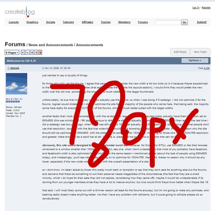
|
|
|
|
|
Nov 24 2008, 06:06 PM
Post
#137
|
|
|
Senior Member Group: Staff Alumni Posts: 4,095 Joined: Jul 2005 Member No: 171,080 |
doesn't work on mac. problem not solved.
|
|
|
|
|
Nov 24 2008, 06:07 PM
Post
#138
|
|
|
poison Group: Official Member Posts: 4,806 Joined: Mar 2008 Member No: 629,020 |
wait how can you zoom?
|
|
|
|
|
Nov 24 2008, 06:15 PM
Post
#139
|
|
|
cb's #1 fan! =) Group: Advisor Posts: 2,342 Joined: Nov 2003 Member No: 1 |
QUOTE(Deetard @ Nov 24 2008, 06:06 PM) doesn't work on mac. problem not solved. download firefox if safari doesnt have a zoom function. QUOTE(Tomates @ Nov 24 2008, 06:07 PM) wait how can you zoom? for IE: page menu -> zoom (or bottom right corner) for firefox: view menu -> zoom |
|
|
|
|
Nov 25 2008, 05:15 PM
Post
#140
|
|
|
cb's #1 fan! =) Group: Advisor Posts: 2,342 Joined: Nov 2003 Member No: 1 |
surprise surprise, guess what youtube's new width is?
 (told you so, about sites increasingly moving to optimize for 1024x768.) |
|
|
|
|
Nov 25 2008, 05:18 PM
Post
#141
|
|
 I'm Jc Group: Mentor Posts: 13,619 Joined: Jul 2006 Member No: 437,556 |
yeah and people are usually watching a video, which doesn't require you to see the whole width of the layout anyway for those people who like to minimize windows. they can watch just the video. unlike a forum where you have to view the whole width to read responses/reply.
just sayin, they prob don't think of it the same way. |
|
|
|

|
Nov 25 2008, 05:21 PM
Post
#142
|
|
|
cb's #1 fan! =) Group: Advisor Posts: 2,342 Joined: Nov 2003 Member No: 1 |
^ like i said before, this site isnt primarily a forum website. its a layout website. and like videos, for layout thumbnails (and browsing), bigger is better.
http://www.youtube.com/blog?entry=0i22UDAOfj8 |
|
|
|
|
Nov 25 2008, 05:22 PM
Post
#143
|
|
|
cb's #1 fan! =) Group: Advisor Posts: 2,342 Joined: Nov 2003 Member No: 1 |
on another note, would you like it if the side column (profile info next to each post) was wider to make the post column thinner? this i can do right away.
|
|
|
|
| *paperplane* |
Nov 25 2008, 05:26 PM
Post
#144
|
|
Guest |
QUOTE(micron @ Nov 24 2008, 06:05 PM) ^ hey did you try zooming out on mozilla. it seems better than IE. zoom out once http://jusunlee.com/cb45/870.gif zoom out twice http://jusunlee.com/cb45/780.gif I always use firefox and it looks fine, but if you were offering I certainly wouldn't object to bigger font for zooming purposes. I agree with JC. and yes, place do whatever you can to make the post column thinner. Any way to get the fast reply thinner too? |
|
|
|
|
Nov 25 2008, 05:41 PM
Post
#145
|
|
|
cb's #1 fan! =) Group: Advisor Posts: 2,342 Joined: Nov 2003 Member No: 1 |
^ hows this (expanded the side columns from 160px to 200px)? the fast reply form didnt change with the widened width.
|
|
|
|
|
Nov 25 2008, 10:51 PM
Post
#146
|
|
|
cb's #1 fan! =) Group: Advisor Posts: 2,342 Joined: Nov 2003 Member No: 1 |
minor update to the layout browse,
when you hover your mouse over the layout screenshot, youll now see the submit date, view count, fav count, and comment count. have tested on ie7, firefox2, and chrome. please let me know if it breaks anything (if youre using a different browser). remember to refresh your browser to make sure the new css is loaded first! =) 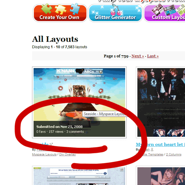
|
|
|
|
|
Nov 26 2008, 06:34 PM
Post
#147
|
|
 That's what she said. Group: Staff Alumni Posts: 3,559 Joined: Apr 2005 Member No: 130,200 |
I actually like the new look alot. Its a lot easier to find things, imo.
 You forgot to add, "bring back arcade", to your to do list. You forgot to add, "bring back arcade", to your to do list.
|
|
|
|

|
Nov 26 2008, 06:41 PM
Post
#148
|
|
|
Amberific. Group: Staff Alumni Posts: 12,913 Joined: Jul 2004 Member No: 29,772 |
QUOTE(micron @ Nov 25 2008, 05:41 PM) ^ hows this (expanded the side columns from 160px to 200px)? the fast reply form didnt change with the widened width. Since the side columns are bigger can we have bigger avatars?
|
|
|
|
|
Dec 2 2008, 05:24 PM
Post
#149
|
|
 Senior Member Group: Official Designer Posts: 5,880 Joined: Nov 2007 Member No: 593,382 |
Ummm i found something wrong.
SOmeone submmitted a layout with a rather long name and its wider than its preview pic and now the layouts on the layouts page arent in order and stuff. Just check it out and youll see what i mean. Its the reeses layout thats doin it. |
|
|
|

|
Dec 2 2008, 05:45 PM
Post
#150
|
|
|
Senior Member Group: Staff Alumni Posts: 4,095 Joined: Jul 2005 Member No: 171,080 |
umm
looks fine to me |
|
|
|
|
2 User(s) are reading this topic (2 Guests and 0 Anonymous Users)
0 Members: