Website |
Resource Center Links
This Month's Contests | Hosts Looking for Hostees | Hostees looking for Hosts | BigBookofResources
Submission Guidelines

 Aug 5 2010, 05:16 PM Aug 5 2010, 05:16 PM
Post
#1
|
|
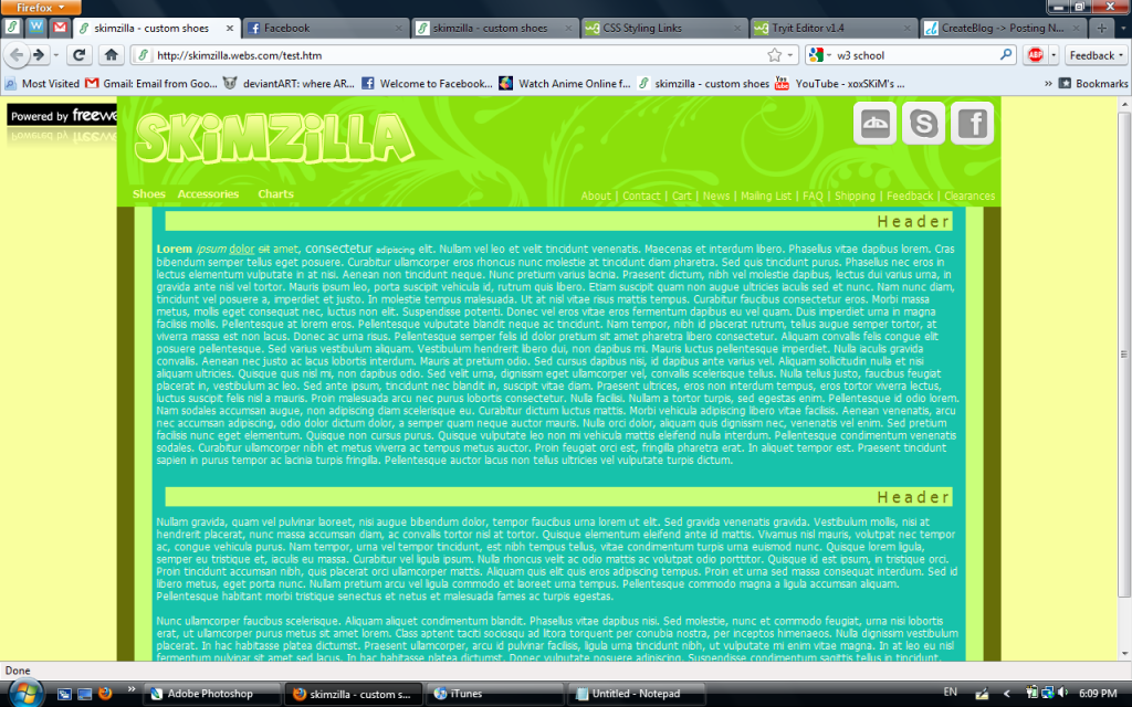
 Sniff, sniff, hooray!  Group: Member Posts: 71 Joined: Mar 2006 Member No: 388,396 |
|
|
|
|


 |
Replies
|
Aug 5 2010, 06:19 PM
Post
#2
|
|
|
Sniff, sniff, hooray! Group: Member Posts: 71 Joined: Mar 2006 Member No: 388,396 |
QUOTE(Cum @ Aug 5 2010, 06:37 PM)  The only thing I'm not digging is the banner. It just doesn't look right with the table content below it.. Everything else looks great. I think changing banner color to brown might help to match with the other brown that connects? Well, it's actually a green-ish color, and it doesn't look too good if it's used in a huge area so I don't think that would help D: QUOTE(manny-the-dino @ Aug 5 2010, 06:40 PM) Too many bright colors plus they don't really match. I got the color palette from that colour lovers thing, so I guess I'm not using those anymore xD QUOTE(brooklyneast05 @ Aug 5 2010, 06:45 PM) not a fan of the colors also not a fan of the text. it's too much. by too much i been too long. it's not legible to read text in really long stretched out sentences like that. that's why people use columns. text columns would not only make it more readable but also give more structure. Well, I'm mainly going to use this website to sell things, not as a blog, so there are going to be more picture than just text. But maybe I'll think about adding some columns. |
|
|
|
|
Aug 5 2010, 11:14 PM
Post
#3
|
|
 Senior Member Group: Staff Alumni Posts: 2,435 Joined: Feb 2007 Member No: 506,205 |
QUOTE(Saraaaah @ Aug 5 2010, 06:19 PM) I got the color palette from that colour lovers thing, so I guess I'm not using those anymore xD Colour Lovers is great, you just have to pick the right palette. I would suggest looking through the top rated ones. Those are the ones that the most people approved of, so they're most likely good. And even if the color combination is good, that doesn't mean it's going to work with what you're trying to do. Some palettes are more geared for graphics, and sometimes you have to exclude or add a color. It's all trial and error. |
|
|
|

|
Aug 6 2010, 12:08 PM
Post
#4
|
|
|
Sniff, sniff, hooray! Group: Member Posts: 71 Joined: Mar 2006 Member No: 388,396 |
QUOTE(schizo @ Aug 6 2010, 12:14 AM) Colour Lovers is great, you just have to pick the right palette. I would suggest looking through the top rated ones. Those are the ones that the most people approved of, so they're most likely good. And even if the color combination is good, that doesn't mean it's going to work with what you're trying to do. Some palettes are more geared for graphics, and sometimes you have to exclude or add a color. It's all trial and error. Ah, yes, that's true. I guess I just wanted something that had a dinosaur kind of feel. Taking another look at the thumbnail, it looks really bad... lol Thanks for all your suggestions  . .
|
|
|
|
Posts in this topic
 Saraaaah Website Aug 5 2010, 05:16 PM
 Cum The only thing I'm not digging is the banner. ... Aug 5 2010, 05:37 PM manny-the-dino Too many bright colors plus they don't really ... Aug 5 2010, 05:40 PM brooklyneast05 not a fan of the colors
also not a fan of the te... Aug 5 2010, 05:45 PM Saraaaah Is this any better?
click to enlarge
live preview Aug 7 2010, 11:03 PM Firiath It looks a lot better than the first one imo but I... Aug 8 2010, 12:01 AM
Cum The only thing I'm not digging is the banner. ... Aug 5 2010, 05:37 PM manny-the-dino Too many bright colors plus they don't really ... Aug 5 2010, 05:40 PM brooklyneast05 not a fan of the colors
also not a fan of the te... Aug 5 2010, 05:45 PM Saraaaah Is this any better?
click to enlarge
live preview Aug 7 2010, 11:03 PM Firiath It looks a lot better than the first one imo but I... Aug 8 2010, 12:01 AM
 Saraaaah QUOTE(Firiath @ Aug 8 2010, 01:01 AM) It ... Aug 8 2010, 11:28 AM Firiath I really don't know - I don't tend to do t... Aug 9 2010, 08:19 AM Saraaaah Hmm... I guess I'll just look around for some ... Aug 9 2010, 03:21 PM schizo I actually don't think the font is too bad. I... Aug 9 2010, 10:42 PM shadowfax I think the font choice is poor; it doesn't ma... Aug 9 2010, 10:50 PM Saraaaah QUOTE(schizo @ Aug 9 2010, 11:42 PM) I ac... Aug 10 2010, 10:40 AM schizo QUOTE(Saraaaah @ Aug 10 2010, 10:40 AM) H... Aug 10 2010, 11:22 AM shadowfax Much better! :) "Sizes" and "1... Aug 10 2010, 11:20 AM Saraaaah QUOTE(shadowfax @ Aug 10 2010, 12:20 PM) ... Aug 10 2010, 04:14 PM jiyong It still feels a little stretched out. You could t... Aug 13 2010, 02:02 PM Saraaaah oOo, that's a good idea. I'll work on that... Aug 14 2010, 08:20 PM
 |
1 User(s) are reading this topic (1 Guests and 0 Anonymous Users)
0 Members: