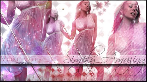
simply amazing., ft. mariah carey |
Resource Center Links
This Month's Contests | Hosts Looking for Hostees | Hostees looking for Hosts | BigBookofResources
Submission Guidelines

 Oct 21 2007, 06:38 PM Oct 21 2007, 06:38 PM
Post
#1
|
|
|
Senior Member  Group: Member Posts: 125 Joined: Aug 2006 Member No: 455,453 |
|
|
|
|


 |
Replies
|
Oct 22 2007, 12:17 AM
Post
#2
|
|
 Cornflakes :D Group: Staff Alumni Posts: 4,541 Joined: Dec 2005 Member No: 322,923 |
It's pretty, I'll agree with people on that. But it just seems way to Cliché for my taste. The font for the "simply amazing" is overused for graphics such as this. I like the colors the most and some of the brushes are nice. Although the star looking ones seem like they were slightly over used and placed oddly. Also the duplicating of the same image just doesn't look right...or the placement rather may be the case.
The only source of advice I could give you is to work with placing images and see what looks best and the size of the images  Also try not to use so much of different elements that the overall image looks cluttered and to busy so the eye is taken away from the main part of the image. Oh I just noticed these, what are the silver things going through the image? |
|
|
|


Posts in this topic
shorty_d09 simply amazing. Oct 21 2007, 06:38 PM AmandaChaosTM i like this alot, except for one little thing, the... Oct 21 2007, 07:31 PM brooklyneast05 i like it except for the second image of her, what... Oct 21 2007, 07:33 PM
 alovesopure QUOTE(brooklyneast05 @ Oct 21 2007, 08:33... Oct 22 2007, 12:12 AM Relentless ^ Yeah, I agree with that part and I was going to ... Oct 22 2007, 12:07 AM doiink what are those toilet paper roll things in the bac... Oct 22 2007, 12:10 AM doiink ^ microphone Oct 22 2007, 12:18 AM Insurmountable ^Wow really? I would have never guessed that. Well... Oct 22 2007, 01:05 AM clarity On the second image, you can see a squarish type o... Oct 22 2007, 11:13 PM IVIike the image is ok as a whole... i don't like the... Oct 23 2007, 02:26 PM tripvertigo yknow i dont mind the font too much. its way overu... Oct 24 2007, 05:36 PM jeanna i like it.. but i think the number of photo throws... Oct 25 2007, 03:43 PM
 |
1 User(s) are reading this topic (1 Guests and 0 Anonymous Users)
0 Members: