Full Version: simply amazing.
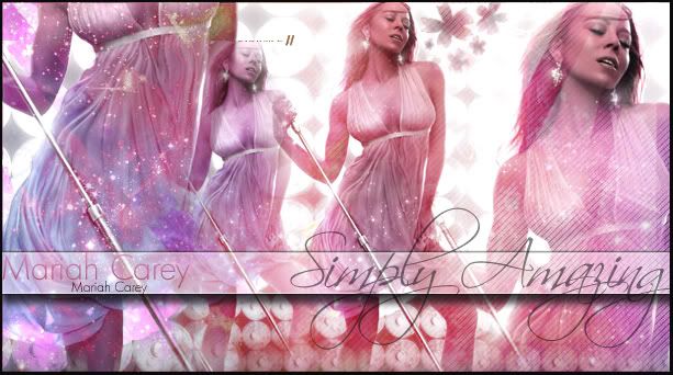
i like this alot, except for one little thing, the first image, without her face, the top of her left shoulder, its like goldish, it sticks out to me for some reason
i like it except for the second image of her, whatever line that is is going right above her forehead is distracting.
^ Yeah, I agree with that part and I was going to mention abou that, however it looks good.
I'm not fond of the "Simply Amazing" Scriptina font.
I'm not fond of the "Simply Amazing" Scriptina font.
what are those toilet paper roll things in the background though?
QUOTE(brooklyneast05 @ Oct 21 2007, 08:33 PM) 
i like it except for the second image of her, whatever line that is is going right above her forehead is distracting.
Agreed, and I don't really like the "simply amazing" font, or that you only used 1 photo and duplicated it.
But other than that, it looks nice I guess. I just wish more photos had been used. I do like the colors, and most of the brushes used.
It's pretty, I'll agree with people on that. But it just seems way to Cliché for my taste. The font for the "simply amazing" is overused for graphics such as this. I like the colors the most and some of the brushes are nice. Although the star looking ones seem like they were slightly over used and placed oddly. Also the duplicating of the same image just doesn't look right...or the placement rather may be the case.
The only source of advice I could give you is to work with placing images and see what looks best and the size of the images
Also try not to use so much of different elements that the overall image looks cluttered and to busy so the eye is taken away from the main part of the image.
Oh I just noticed these, what are the silver things going through the image?
^ microphone
^Wow really? I would have never guessed that. Well then to add, it looks out of place to have it up there 4 times o_O and since some of the images scale is larger then you don't really see how its a microphone when it goes off of the image..
On the second image, you can see a squarish type of look to it. Try to avoid that when blending. Over all, It is very colorful and unique.
the image is ok as a whole... i don't like the font 
yknow i dont mind the font too much. its way overused these days, but i think it fits this graphic.
what IS bugging me is the repetitiveness. especially since shes holding a mic stand like that, its just too much. use other photos.
what IS bugging me is the repetitiveness. especially since shes holding a mic stand like that, its just too much. use other photos.
i like it.. but i think the number of photo throws it off. try using an odd number maybe
This is a "lo-fi" version of our main content. To view the full version with more information, formatting and images, please click here.