Next Saturday Clothing Company, 3 Tee's done. |
Resource Center Links
This Month's Contests | Hosts Looking for Hostees | Hostees looking for Hosts | BigBookofResources
Submission Guidelines

 Mar 9 2009, 05:12 PM Mar 9 2009, 05:12 PM
Post
#1
|
|
 Senior Member  Group: Member Posts: 254 Joined: Aug 2008 Member No: 682,007 |
So i threw out what i originally had & started w/3 new mockups.
lemme knw what u think, any & everything welcome. :] 1)Nat the Dino 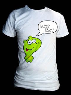 2)Vertical Stunna Shades 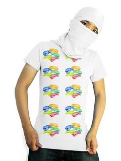 *i think there needs 2 be more on this, what? 3)Stunna Necklace 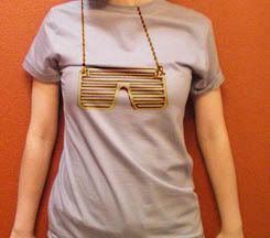 *i would like the necklace to be in gold & foil print |
|
|
|


 |
Replies
(1 - 20)
|
Mar 9 2009, 07:59 PM
Post
#2
|
|
 Senior Member Group: Administrator Posts: 8,629 Joined: Jan 2007 Member No: 498,468 |
1)
 I just think the dinosaur doesn't really look like a dinosaur. it reminds me of Invader Zim, for some reason. I just think the dinosaur doesn't really look like a dinosaur. it reminds me of Invader Zim, for some reason.2) I agree something's missing. i just don't know what. "/ 3) I like it. Except consider moving over the chain on the right because it looks like it's going through her neck. Overall, they look nice. 
|
|
|
|


|
Mar 9 2009, 08:02 PM
Post
#3
|
|
|
Senior Member Group: Staff Alumni Posts: 4,665 Joined: Aug 2008 Member No: 676,364 |
1st IMG: Cutee! I think it looks better with a bright color instead of a white tee.
2nd IMG: The pattern looks too simple to be honest. Something is missing. 3rd IMG: The shades kind of look misaligned, but overall, pretty neat. |
|
|
|

|
Mar 9 2009, 08:03 PM
Post
#4
|
|
 kthxbai Group: Official Designer Posts: 2,832 Joined: Feb 2008 Member No: 621,203 |
I don't understand the last one.
|
|
|
|


|
Mar 9 2009, 08:35 PM
Post
#5
|
|
|
Senior Member Group: Administrator Posts: 8,629 Joined: Jan 2007 Member No: 498,468 |
^It's suppose to be some glasses on a chain, to make a necklace.
|
|
|
|
|
Mar 9 2009, 09:04 PM
Post
#6
|
|
|
Senior Member Group: Member Posts: 254 Joined: Aug 2008 Member No: 682,007 |
@Nat: yea, it doesn't really remind me of a dino either i guess i could jus call it by its name HAH.
@Benley: yea, ima try the bright color thing @Both: Idk what the second is missing either, text? @emberfly: see Nats post as for the chain alignment ill get to that. |
|
|
|
|
Mar 9 2009, 09:05 PM
Post
#7
|
|
|
kthxbai Group: Official Designer Posts: 2,832 Joined: Feb 2008 Member No: 621,203 |
the chain alignment was why I didn't understand it.
|
|
|
|
|
Mar 9 2009, 09:19 PM
Post
#8
|
|
 f your couch Group: Official Member Posts: 3,089 Joined: Dec 2006 Member No: 491,301 |
#2, let's see.... maybe if you do just one cluster of the stunna shades with some.... fireworks or something around 'em.
|
|
|
|

|
Mar 9 2009, 10:04 PM
Post
#9
|
|
|
Senior Member Group: Member Posts: 254 Joined: Aug 2008 Member No: 682,007 |
@ emberfly: ic, ya im in the process of fixing this atm
@ smash: that is a really good idea, ill try it out. off topic: but when i move something to a color tee & use one of the layer options (ea. darken, lighten etc) it changes the color of what ive moved or if its white it removes the color all together. solution? |
|
|
|
|
Mar 9 2009, 10:08 PM
Post
#10
|
|
|
f your couch Group: Official Member Posts: 3,089 Joined: Dec 2006 Member No: 491,301 |
glad you like it. let us know what your final decision is. i can't help you with that last question. i'll leave it to the pros.
|
|
|
|
|
Mar 9 2009, 10:21 PM
Post
#11
|
|
|
Senior Member Group: Administrator Posts: 8,629 Joined: Jan 2007 Member No: 498,468 |
QUOTE(shakeene @ Mar 9 2009, 08:04 PM)  off topic: but when i move something to a color tee & use one of the layer options (ea. darken, lighten etc) it changes the color of what ive moved or if its white it removes the color all together. solution? Hmm I think I know what you're trying to say but I'm not fully sure. Can you provide us with a screenshot? |
|
|
|
|
Mar 9 2009, 11:07 PM
Post
#12
|
|
|
Senior Member Group: Member Posts: 254 Joined: Aug 2008 Member No: 682,007 |
|
|
|
|

|
Mar 9 2009, 11:10 PM
Post
#13
|
|
|
Senior Member Group: Administrator Posts: 8,629 Joined: Jan 2007 Member No: 498,468 |
Oh okay. Well that's because you changed the layer option. Whenever you change it's option, the image will change. It can change the color, make it bright, make it darker, etc.
|
|
|
|
|
Mar 9 2009, 11:26 PM
Post
#14
|
|
|
Senior Member Group: Member Posts: 254 Joined: Aug 2008 Member No: 682,007 |
i have this idea going so far, im having trouble though making the txt look realistic.
ya or nae? 
|
|
|
|
|
Mar 9 2009, 11:27 PM
Post
#15
|
|
|
Senior Member Group: Member Posts: 254 Joined: Aug 2008 Member No: 682,007 |
QUOTE(manny-the-dino @ Mar 9 2009, 11:10 PM) Oh okay. Well that's because you changed the layer option. Whenever you change it's option, the image will change. It can change the color, make it bright, make it darker, etc. okay well i figured this, but this is the only way i knw of too make the tee's look realitic & show the shadows, folds etc |
|
|
|
|
Mar 10 2009, 02:18 AM
Post
#16
|
|
 사랑해 ~ 我愛你 ♥ Group: Design Staff Posts: 825 Joined: Jan 2007 Member No: 492,587 |
#1: I really like this one. I personally think it looks great on a white tee.
#2: I think what would make it pop out more is if you had the same pattern, but with bigger and smaller versions of the shades overlapped all over the shirt, so that there's more variety to the pattern. #3: Misaligned, but you already got that from the other people. Great job (: |
|
|
|

|
Mar 12 2009, 07:15 PM
Post
#17
|
|
|
f your couch Group: Official Member Posts: 3,089 Joined: Dec 2006 Member No: 491,301 |
QUOTE(shakeene @ Mar 9 2009, 11:26 PM) i have this idea going so far, im having trouble though making the txt look realistic. ya or nae? ya. maybe make the text flow with the curves of the shirt. idk. not my area of expertise. |
|
|
|
|
Mar 12 2009, 08:30 PM
Post
#18
|
|
 Senior Member Group: Official Member Posts: 1,288 Joined: Oct 2007 Member No: 585,380 |
QUOTE QUOTE 2)Vertical Stunna Shades *i think there needs 2 be more on this, what? 3)Stunna Necklace *i would like the necklace to be in gold & foil print Love those ones, but not feeling the dinosaur one. You should make a shirt (And take to mind that this is just a random idea i have) with a torso, just like a black silhouette with no head or arms but have shutter shades where they would be on the persons head a silhouette too. |
|
|
|

|
Mar 12 2009, 08:33 PM
Post
#19
|
|
|
Senior Member Group: Administrator Posts: 8,629 Joined: Jan 2007 Member No: 498,468 |
QUOTE(shakeene @ Mar 9 2009, 09:27 PM) okay well i figured this, but this is the only way i knw of too make the tee's look realitic & show the shadows, folds etc Ohh okay. Well I dk what to tell you. I know nothing about designing t-shirts.  QUOTE(smash @ Mar 12 2009, 05:15 PM) ya. maybe make the text flow with the curves of the shirt. idk. not my area of expertise. I agree. It looks like it doesn't have shape like the t-shirt. |
|
|
|
| *Janette* |
Mar 16 2009, 01:36 AM
Post
#20
|
|
Guest |
I like them all, but mostly the last one. The chain alignment isn't even that big of a deal.
|
|
|
|
|
Mar 16 2009, 12:57 PM
Post
#21
|
|
 Coming from Illinois Group: Member Posts: 319 Joined: Mar 2009 Member No: 718,627 |
The alignment of that chain should be fixed to be more realistic.
For the last shirt that you updated here, about the text not being realistic. Use the warp modes by holding down ctrl+t and then pressing the button in the top bar that kinda looks like:  |
|
|
|

 |
2 User(s) are reading this topic (2 Guests and 0 Anonymous Users)
0 Members: