Myspace Revamp |
Resource Center Links
This Month's Contests | Hosts Looking for Hostees | Hostees looking for Hosts | BigBookofResources
Submission Guidelines

 Mar 3 2009, 11:06 AM Mar 3 2009, 11:06 AM
Post
#1
|
|
 사랑해 ~ 我愛你 ♥  Group: Design Staff Posts: 825 Joined: Jan 2007 Member No: 492,587 |
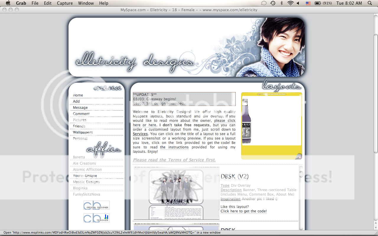
I was bored yesterday and decided to redesign my Myspace layout for my layout site. What do you think? Opinions?
--> myspace.com/elletricity I think it's private so if you don't want to add me: EDITED |
|
|
|


 |
Replies
(1 - 8)
|
Mar 3 2009, 04:28 PM
Post
#2
|
|
|
Senior Member Group: Staff Alumni Posts: 4,665 Joined: Aug 2008 Member No: 676,364 |
the text seems clean but still could be better. i like the banner.
btw, what's that bottle thing on your myspace profile? that seems to be a big, major take-up- space ad. |
|
|
|


|
Mar 3 2009, 04:31 PM
Post
#3
|
|
 Senior Member Group: Official Member Posts: 2,936 Joined: Sep 2008 Member No: 683,235 |
that's for social vibe.
|
|
|
|

|
Mar 3 2009, 05:04 PM
Post
#4
|
|
 Naomi loves you. Y'all may call me NaNa Group: Official Designer Posts: 2,925 Joined: Jun 2006 Member No: 427,774 |
I like it, not a big fan of the colors though.
|
|
|
|

|
Mar 3 2009, 05:22 PM
Post
#5
|
|
 Senior Member Group: Staff Alumni Posts: 2,435 Joined: Feb 2007 Member No: 506,205 |
I love the banner. That brush you used is pretty.
My only minor criticism is the amount of shadow on the boxes. |
|
|
|

|
Mar 3 2009, 09:36 PM
Post
#6
|
|
 Senior Member Group: Administrator Posts: 8,629 Joined: Jan 2007 Member No: 498,468 |
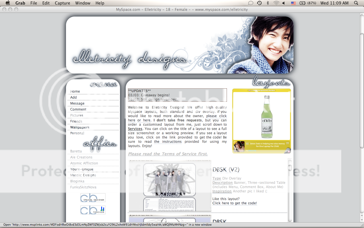
It's cute; I like it. Did you submit it here? I think I saw it in the queue. But yeah I agree with Gabi on the shadows. Other than that, it's great. :D
|
|
|
|

|
Mar 3 2009, 11:55 PM
Post
#7
|
|
|
사랑해 ~ 我愛你 ♥ Group: Design Staff Posts: 825 Joined: Jan 2007 Member No: 492,587 |
QUOTE(manny-the-dino @ Mar 3 2009, 06:36 PM)  It's cute; I like it. Did you submit it here? I think I saw it in the queue. But yeah I agree with Gabi on the shadows. Other than that, it's great. :D You might have seen a layout similar to it, since I use a similar stylesheet for other layouts. I'll fix the shadows tonight (: |
|
|
|
|
Mar 4 2009, 02:12 PM
Post
#8
|
|
|
사랑해 ~ 我愛你 ♥ Group: Design Staff Posts: 825 Joined: Jan 2007 Member No: 492,587 |
I changed the shadows - any better?
|
|
|
|
|
Mar 4 2009, 06:44 PM
Post
#9
|
|
|
Senior Member Group: Administrator Posts: 8,629 Joined: Jan 2007 Member No: 498,468 |
Looks good. :)
|
|
|
|
 |
1 User(s) are reading this topic (1 Guests and 0 Anonymous Users)
0 Members: