I was bored yesterday and decided to redesign my Myspace layout for my layout site. What do you think? Opinions?
--> myspace.com/elletricity
I think it's private so if you don't want to add me:
EDITED
Full Version: Myspace Revamp
the text seems clean but still could be better. i like the banner.
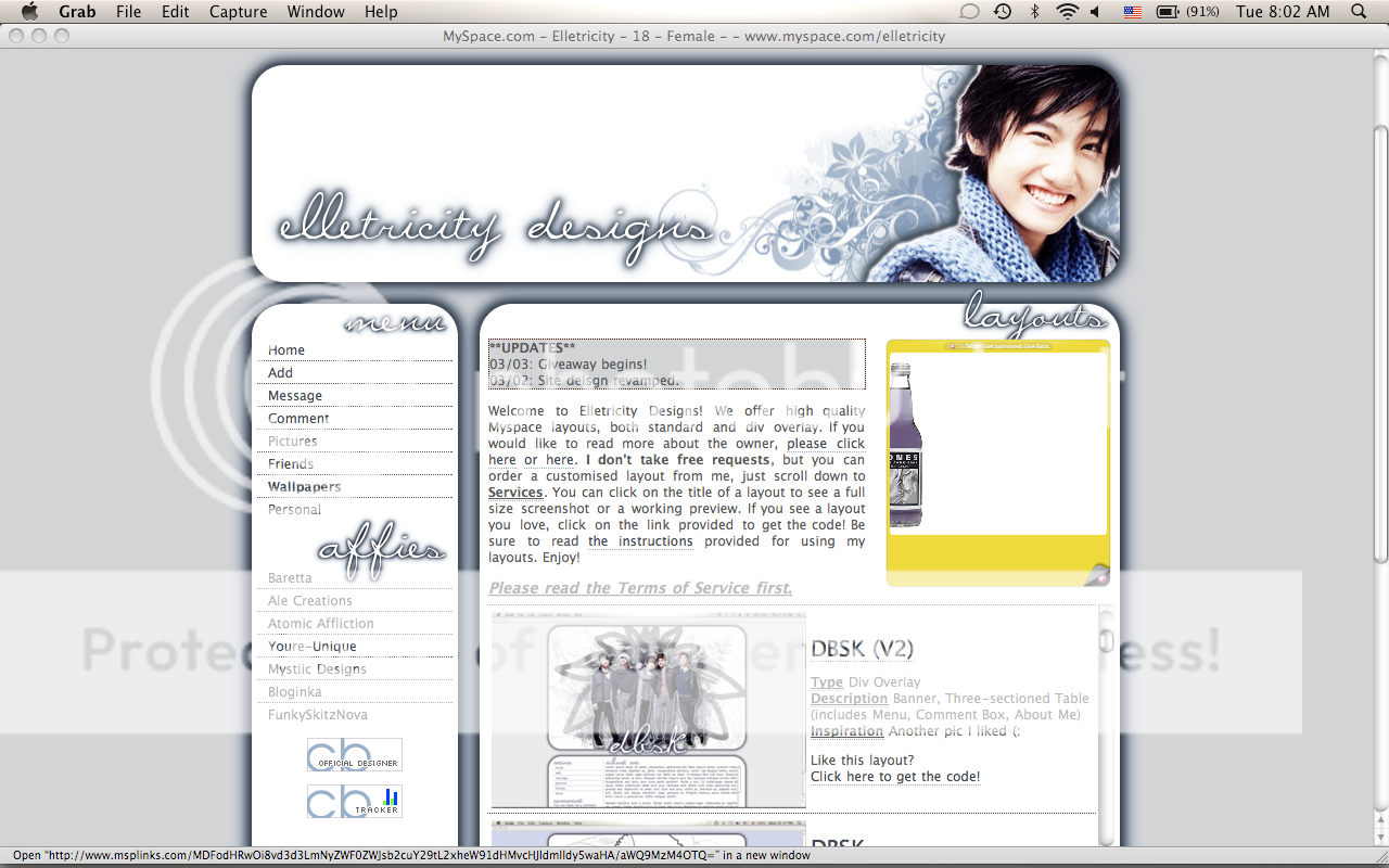
btw, what's that bottle thing on your myspace profile? that seems
to be a big, major take-up- space ad.
btw, what's that bottle thing on your myspace profile? that seems
to be a big, major take-up- space ad.
that's for social vibe.
I like it, not a big fan of the colors though.
I love the banner. That brush you used is pretty.
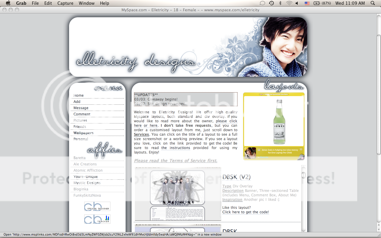
My only minor criticism is the amount of shadow on the boxes.
My only minor criticism is the amount of shadow on the boxes.
It's cute; I like it. Did you submit it here? I think I saw it in the queue. But yeah I agree with Gabi on the shadows. Other than that, it's great. :D
QUOTE(manny-the-dino @ Mar 3 2009, 06:36 PM) 
It's cute; I like it. Did you submit it here? I think I saw it in the queue. But yeah I agree with Gabi on the shadows. Other than that, it's great. :D
You might have seen a layout similar to it, since I use a similar stylesheet for other layouts. I'll fix the shadows tonight (:
I changed the shadows - any better?
Looks good. :)
This is a "lo-fi" version of our main content. To view the full version with more information, formatting and images, please click here.