another layout. |
Resource Center Links
This Month's Contests | Hosts Looking for Hostees | Hostees looking for Hosts | BigBookofResources
Submission Guidelines

 Aug 9 2008, 03:44 PM Aug 9 2008, 03:44 PM
Post
#1
|
|
|
AKA RockIt Studios  Group: Official Member Posts: 2,286 Joined: Jun 2006 Member No: 421,809 |
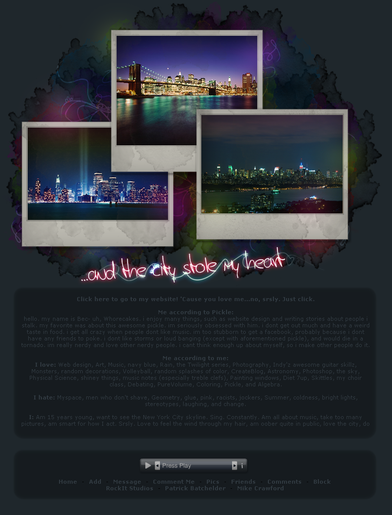
I scaled down the original image, 'cause it was just way to big to be a header. I played around with positioning and liked it best to the left. I also played around with a lot of different content containers and such, but I liked the simple two boxes I have. Sorry for the automatically playing music, but it was necessary.
 I don't think I'm going to submit this one. Probably just keep it as a personal layout. link: http://www.myspace.com/animatedheart screenshot. (thumbed) |
|
|
|


 |
Replies
(1 - 10)
|
Aug 9 2008, 03:47 PM
Post
#2
|
|
 R U A Q T ? [; Group: Official Member Posts: 7,276 Joined: Jun 2006 Member No: 421,631 |
dang, i like it. it looks really nice :D great job on the layout [:
|
|
|
|

|
Aug 9 2008, 03:47 PM
Post
#3
|
|
 Hello Newman. Group: Member Posts: 912 Joined: Sep 2007 Member No: 578,620 |
I love it!
I especially love the pattern in the background. Awesome job. 
|
|
|
|


|
Aug 9 2008, 05:09 PM
Post
#4
|
|
|
Senior Member Group: Official Member Posts: 1,028 Joined: Sep 2007 Member No: 579,129 |
Ahh, it looks really pretty. I like the water stain-like thingy you have there. It looks so cool. I'm just wondering if it would look better if you turned some of the Polaroids a little bit.
|
|
|
|

|
Aug 11 2008, 11:02 AM
Post
#5
|
|
|
AKA RockIt Studios Group: Official Member Posts: 2,286 Joined: Jun 2006 Member No: 421,809 |
thanks for the feedback!
i tried turning the polaroids a bit, but they didn't work with the simplicity of the rest of it. the text, however, is slanted a little bit. |
|
|
|
|
Aug 11 2008, 12:48 PM
Post
#6
|
|
 the name's mario Group: Official Member Posts: 1,270 Joined: Jun 2008 Member No: 656,520 |
i like it, i think it would be better centered
but it's for your personal use so yeahh.. keep it to the left |
|
|
|

|
Aug 11 2008, 01:11 PM
Post
#7
|
|
 sang loves hayden. Group: Staff Alumni Posts: 3,373 Joined: Feb 2004 Member No: 5,687 |
It looks good. Yeah, it would be nice if it was centered. Other then that, great job.
Is there like a hidden scrollbar or something? I viewed it in FF and there is no scrollbar but when I use my scroll bar thing, theres scrolling. o.O |
|
|
|


|
Aug 11 2008, 02:11 PM
Post
#8
|
|
 torn Group: Official Designer Posts: 953 Joined: Oct 2004 Member No: 55,718 |
It's beautiful! I love the image, and I like the colors you chose. I agree with the center-aligned thing, though.
I wants a wallpaper of that. :D |
|
|
|

|
Aug 11 2008, 06:07 PM
Post
#9
|
|
|
AKA RockIt Studios Group: Official Member Posts: 2,286 Joined: Jun 2006 Member No: 421,809 |
QUOTE(Relentless @ Aug 11 2008, 01:11 PM)  It looks good. Yeah, it would be nice if it was centered. Other then that, great job. Is there like a hidden scrollbar or something? I viewed it in FF and there is no scrollbar but when I use my scroll bar thing, theres scrolling. o.O yep. it's just simply covered with an image. i've been getting really frustrated with those stupid ugly scrollbars lately, so i just covered the f**kers up. QUOTE(venti-anemoi @ Aug 11 2008, 02:11 PM) It's beautiful! I love the image, and I like the colors you chose. I agree with the center-aligned thing, though. I wants a wallpaper of that. :D if you follow the original image link, it should be decently big enough to use as a background. i liked the left alignment. 
|
|
|
|
|
Aug 11 2008, 10:40 PM
Post
#10
|
|
|
torn Group: Official Designer Posts: 953 Joined: Oct 2004 Member No: 55,718 |
Oh, but I have a really big screen resolution (1280x1024). :( Would you mind if I edited it and added some more background color on a bigger canvas so that it doesn't stretch or repeat if I put it as my desktop?
And regarding the center-aligned thing, if it's personal preference, then I think it's fine. 
|
|
|
|
|
Aug 12 2008, 12:33 AM
Post
#11
|
|
 Amberific. Group: Staff Alumni Posts: 12,913 Joined: Jul 2004 Member No: 29,772 |
Wow. That's superfancy with the coding. Doesn't even resemble a myspace. Cripes, you're talented.
|
|
|
|

 |
1 User(s) are reading this topic (1 Guests and 0 Anonymous Users)
0 Members: