city |
Resource Center Links
This Month's Contests | Hosts Looking for Hostees | Hostees looking for Hosts | BigBookofResources
Submission Guidelines
  |

 Aug 3 2008, 08:21 PM Aug 3 2008, 08:21 PM
Post
#1
|
|
|
AKA RockIt Studios  Group: Official Member Posts: 2,286 Joined: Jun 2006 Member No: 421,809 |
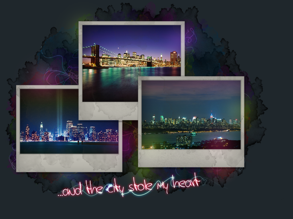
obviously inspired by my love of the city.
all three photos are in new york city. credit to Scott Murphy and Patrick Batchelder I originally wanted it to be a smallish header for a layout, but sort of turned out as a big one. I spruced up the text (it took me three hours to get simulate pressure to work) by adding the city skyline to the c in city, and adding the glowy lines. originally, only the blue one was there and I thought it wasn't enough. then I added the red one and now it feels like too much.  anyways. opinions/suggestions? thumbed. number twooo: |
|
|
|


|
Aug 3 2008, 08:25 PM
Post
#2
|
|
 I'm Jc Group: Mentor Posts: 13,619 Joined: Jul 2006 Member No: 437,556 |
overall i like it.
i think in some ways it seems like two separate things, the pictures and the background. i think that's due to the blue in the two side pics. the blue in those doesn't really work with the background as well. the picture in the middle though seems to have colors in it that work a lot better with the background. obviously finding pics that mimic those colors isn't easy, but if they did i think it would all flow better as one piece. like i said though, it's nice for the most part. |
|
|
|


|
Aug 3 2008, 09:41 PM
Post
#3
|
|
 DDR \\ I'm Dee :) Group: Mentor Posts: 8,662 Joined: Mar 2006 Member No: 384,020 |
I would've made the background colors a little darker, but I like how the background flows into the polaroids. It looks really good.
|
|
|
|

|
Aug 3 2008, 10:00 PM
Post
#4
|
|
 sang loves hayden. Group: Staff Alumni Posts: 3,373 Joined: Feb 2004 Member No: 5,687 |
I really like the photos. Also, the bright light swirl lines thing.
Where did you manage to get those good photos? Those are some nice shots. Oh wait, did you colorize them? o.O |
|
|
|


|
Aug 3 2008, 10:05 PM
Post
#5
|
|
|
AKA RockIt Studios Group: Official Member Posts: 2,286 Joined: Jun 2006 Member No: 421,809 |
updated original post with image.
QUOTE(brooklyneast05 @ Aug 3 2008, 08:25 PM)  i think in some ways it seems like two separate things, the pictures and the background. i think that's due to the blue in the two side pics. the blue in those doesn't really work with the background as well. the picture in the middle though seems to have colors in it that work a lot better with the background. obviously finding pics that mimic those colors isn't easy, but if they did i think it would all flow better as one piece. I colored the pictures a little bit. tried to make them blend more. now I think it's too much.  QUOTE(karmakiller @ Aug 3 2008, 09:41 PM) I would've made the background colors a little darker, but I like how the background flows into the polaroids. It looks really good. I lowered the opacity of the little glowy color blobs. :] also lowered the opacity of the red glowy line (I couldn't live without it there, but it was too much). QUOTE(Relentless @ Aug 3 2008, 10:00 PM) I really like the photos. Also, the bright light swirl lines thing. Where did you manage to get those good photos? Those are some nice shots. Oh wait, did you colorize them? o.O there are links to the artists in my main post.  i just went back and colorized the ones on the sides (the middle is still it's original) to make them flow a little more. |
|
|
|
|
Aug 3 2008, 11:00 PM
Post
#6
|
|
 Oh Wow ... Group: Official Designer Posts: 688 Joined: Sep 2006 Member No: 468,522 |
Great picture & color choices.
The font is okay. I like the first one the best though. But definitely BOTH are hella good. |
|
|
|

|
Aug 4 2008, 01:00 PM
Post
#7
|
|
 Senior Member Group: Staff Alumni Posts: 1,815 Joined: Jun 2006 Member No: 423,396 |
I love the colorth.
|
|
|
|

|
Aug 4 2008, 01:28 PM
Post
#8
|
|
 yo yo yiggidy yo. Group: Official Member Posts: 1,606 Joined: Mar 2005 Member No: 108,591 |
the photos are gorgeous. i really like both of them. great job!

|
|
|
|

|
Aug 4 2008, 09:47 PM
Post
#9
|
|
|
AKA RockIt Studios Group: Official Member Posts: 2,286 Joined: Jun 2006 Member No: 421,809 |
QUOTE(Anarchy @ Aug 4 2008, 12:52 PM) Those photographs are incredible! I like the font, as well. I prefer the second one, though. I agree with it being a little too busy around the text. You should try removing the red swirl under the text and change the font color to red. Either that or try adding a black shadow to the white text, because it's a bit hard to understand it. Other than that, it's amazing. oo, thanks for the tip! I added a red glow to the text. also, I changed the top photo. the other one sort of wasn't fitting. new photo credit: amazingnewyorkcity |
|
|
|
|
Aug 6 2008, 01:14 PM
Post
#10
|
|
 Senior Member Group: Member Posts: 51 Joined: Aug 2008 Member No: 674,491 |
THose are really pretty pictures!~
|
|
|
|

|
Aug 6 2008, 01:17 PM
Post
#11
|
|
 the name's mario Group: Official Member Posts: 1,270 Joined: Jun 2008 Member No: 656,520 |
that looks nice
there's something in it... the lights... it makes it look neat... i like it |
|
|
|

|
1 User(s) are reading this topic (1 Guests and 0 Anonymous Users)
0 Members: