Jennifer Aniston (comments)
Displaying 1 - 14 of 14 comments


as everyone already mentioned, the alignment isn`t good for IE and Firefox. other than that, the layout is really good looking. you picked a nice shade of green, and the image is really cute.


Umm, in either of the previews (and I'm using IE), the actual image and then the content aren't aligned together... I mean, the image/header looks fine, but then the content area is mis-laigned by about 50px, or something. It's a cool layout, though. =]

This one is amazing lol from the preview that is.
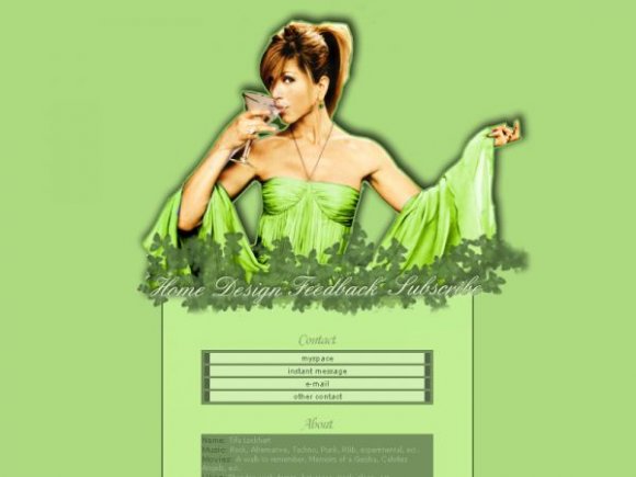
The colors are so good and Jen looks fab.

I think you made this for big screen resolutions? And yeah, everything is really mis-aligned. The content is moved all the way up to the left top for me. Would you like a screen shot dear? :]

Nice, just that the preview seems to throw the whole thing out of wack.


i have ff and the layout looks misaligned on my screen =\ it doesnt show like the screenshot..jennifer is to the right of the screen and everything else is to the left...

Beautiful layout, I love the colors. Though there is a blue spot in the layout by jennifer's left arm as well as a blueish tint to the green on her right arm where her shrug thing meets her arm.


im using ie, but i feel the need to comment.
the preview that you made looked gorgeous, except there seems to be a blue thing behind the psd.
i think you should make all layout both ie and ff compatible
Add Comment
You must be logged in to comment
Layout Details
| Designer |
Mm-giraffe
|
| Submitted on | Jul 19, 2007 |
| Page views | 10103 |
| Favorites | 9 |
| Comments | 14 |
| Reviewer |
karmakiller
|
| Approved on | Jul 20, 2007 |