Using This Layout
For specific instructions read designer's comments
- 1. Disable Xanga themes (edit theme -> uncheck make this your active theme -> save)
- 2. Log into xanga.com (look & feel)
- 3. Copy (ctrl c) and paste (ctrl v) code to the specified fields
Layout Comments
Showing latest 7 of 7 comments

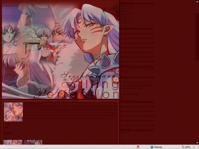
er, the navigation text is impossible to read although the main banner is lovely!
By tainted-twilight on Jun 26, 2007 9:15 am

idk about this one.. could be better
By Chicago on May 14, 2007 9:29 pm

I like the idea of having the larger picture of Shessoumaru (sp?) on the right -- it's a nice touch.Although, I don't like the blending of the pictures on the left. By having 5 different pictures, it looks too cluttered. Instead, I suggest maybe j
By Just_Dream on Apr 30, 2007 10:08 am

i don't like anime at all but i love the way you put your stuff together
By IVIike on Apr 23, 2007 9:50 am

It's great except for the blending on the images to the left. The title's cool, though.
By Kathleen on Apr 9, 2007 11:27 am
aw, it`s lovely!
By smilin_sister on Apr 2, 2007 10:42 pm
This is pretty cool. The main text color's hard to read though.
By tokyo-rose on Apr 1, 2007 12:21 pm
Layout Details
| Designer |
AbsentEmotions
|
| Submitted on | Mar 31, 2007 |
| Page views | 6,979 |
| Favorites | 6 |
| Comments | 7 |