Designer's Comments
Look carefully for specific instructions
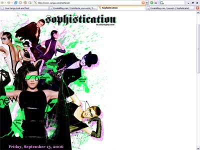
Best viewed in FIREFOX (it's aligned and fine in IE except for the fact that the text may not show in 6&7 due to glitches with the z-index) 1024x768.
Width: 100
Alignment: Left
Credits: echoica.net, 44suburbia.org
Width: 100
Alignment: Left
Credits: echoica.net, 44suburbia.org
Using This Layout
For specific instructions read designer's comments
- 1. Disable Xanga themes (edit theme -> uncheck make this your active theme -> save)
- 2. Log into xanga.com (look & feel)
- 3. Copy (ctrl c) and paste (ctrl v) code to the specified fields
Layout Comments
Showing latest 6 of 6 comments

wow very nice! i love the colours =)
By 0nadia0 on Jul 6, 2007 12:20 am

i really like the header except for the green it's too bright for me
By IVIike on May 11, 2007 2:11 pm

Those are great images you used, and the colors are very eyecatching. ^^
By tokyo-rose on Nov 3, 2006 10:15 pm

It looks fabulous at the top, but when I scroll down, the right seems far too empty.
By gelionie on Oct 8, 2006 11:41 am
I agree, its still nice looking though, I like the colors!
By Anna Banana =} on Oct 3, 2006 12:37 pm

Nicely done deary, although it doesn't look the same on my resolution as it does in the screen shot, instead of it being on the left side its more like in the middle on my resolution. -shrugs- Looks nice though.
By Insurmountable on Sep 30, 2006 1:33 am