Layout Comments
Showing latest 5 of 5 comments

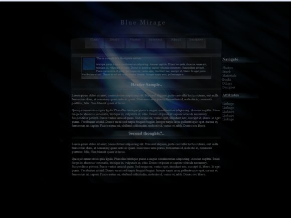
This is perfect... I don't have a big issue with reading the text, and the font color coupled with the background gives a very mYsTeRiOuS feel, I'm loving it.
By CuntBlog on Sep 19, 2010 7:02 pm

I agree with the others. Also, it wasn't centered on my screen, but I didn't really mind... it was close enough.
By emberfly on Aug 12, 2010 7:53 pm

Unique design :)
By volverene on Jul 28, 2010 2:18 pm

It looks good on the computer I'm on now but I viewed it earlier on a different computer and it was very dark - to the point where I had a hard time reading it. The design is great, though. :D
By schizo on Jul 26, 2010 11:37 pm

Thank you for sharing this with the rest of us but honestly, this is too dark...and kind of blurry. I can't really see what's under the light at center (but that's just me).
By Butterface89 on Jul 26, 2010 10:56 am