Designer's Comments
Look carefully for specific instructions
If you use this layout DO NOT remove the credits !
Enjoy :)
Layout Comments
Showing latest 7 of 7 comments

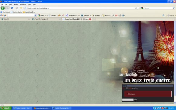
This is nice, normally I don't like the right aligned though cause sometimes you have the scrollbar at the bottom, which bugs me, but this doesn't do that =D. I love your banner styles. The only thing I would say is I wish that the navigation links were a different color than the font used on the banner to give a better indication that they are links. whew, long comment. :)

Nice. I really like the font you used for the navigation.

the image is a bit dark for me, but still nice. (:
This looks amazing. I like the different fonts.
The layout looks nice as it is!
GOOD JOB :D

woah! i like thiss! i disagree about it being on the right; i think that adds more to the layout itself and makes it look great

This one's nice, but I wish it wasn't stuck to the right like that. Centered would have been much nicer. Otherwise, good job. :)