Abandoned (comments)
Displaying 1 - 20 of 25 comments


Nope, seems fine to me. Tried it out on both of my monitors. :)

Edit: Actually, I believe I just fixed it. The only problem is that the "grass" still ends, but that will be for another night! ;)
Yeahhhh Rumms I noticed that, I keep meaning to fix it, all I have to do is make a white image to cover it up. It's outside my resolution so I didn't notice it at first. Thanks so much! Haha I promise to fix it eventually...
Great design, but I should just point out that there is a large black area where the header ends, and I'm sure it's not intentional. This is what I mean http://imgur.com/6gKh4.jpg it's probably a resolution issue, just scan over your css, it looks like an easy fix. For the record I'm using a 16:9 resolution.

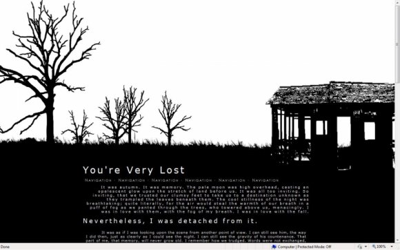
I don't know what my fascination with tree silhouettes is, but I love them and this layout is gorgeous =) Good job.


awesome work!!
is it alright to modify it, so long as i leave your credit on?


I truly love all of your layouts, especially this one.


Oh man, I know what you mean about the lazy...so many unfinished projects! T-T
But yeah it looks much better! Definitely easier on the eyes. Nice work! :D
Okay, I updated the font faces & colors. 8)
Tell me if it's any better...
Yeah, Pandora, to be honest I completely rushed the typography, so it's probably good that you drilled me for it. I had experimented with gray font colors and gave up because I was being lazy. I didn't want to risk it being too light, you know? I'll probably mess around with it some more... Haha this is what happens when you throw something together overnight. :P

This is a really good concept, but to be honest mate the typography sucks. :x The words are so small and paragraphs so compact, it just turns into a blur (and I'm not old with crappy vision, mind you, I'm only 18) and becomes difficult to read after about ten seconds. A lower contrast colour, like a medium to high per cent grey would be fantastic, and you could even leave the links white to highlight them.
Don't mean to offend, I just think you could take this a few steps further. :3
Other than that, I do love the idea of simplicity you're working for.


Thank you everyone!
I'm sorry it's not a myspace layout, haha. I sort of gave up on myspace a while ago. X)
Add Comment
You must be logged in to comment
Layout Details
| Designer |
CrotchetTheLeper
|
| Submitted on | Aug 27, 2009 |
| Page views | 20037 |
| Favorites | 145 |
| Comments | 25 |
| Reviewer |
elletricity
|
| Approved on | Aug 27, 2009 |