Designer's Comments
Look carefully for specific instructions
DONT REMOVE THE CREDIT!
Layout Comments
Showing latest 8 of 8 comments

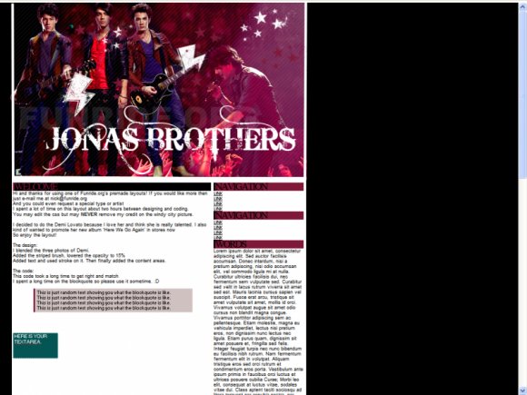
I don't know. Without the bolts it looks too plain to me. I like it.
By futura on Jul 27, 2009 1:11 am

everything is great but theres only one thing that bothers me but since everyone else has already said it i wont repeat it hehe
By mystiicdesigns on Jul 26, 2009 7:01 pm

Aw mann, it would look way better without the lightning bolts. :\
By Mikeplyts on Jul 25, 2009 2:07 pm

elletricity is right.
I do love the blending and the coloring.
Real, amazing!
;]
By xii3 on Jul 25, 2009 9:21 am

I agree with ellectricity also. But other than that, it's still a nice layout. Nice job :)
By CandyPop on Jul 25, 2009 7:46 am

The font and the lightening bolt don't blend in
&& I your credit is so big! You should have put the watermark somewhere else and smaller.
By Firiath on Jul 25, 2009 6:59 am

I agree with ellectricity. I like the blending.
By famousnerd on Jul 25, 2009 2:32 am

Nice blending. Lightening bolts are a bit distracting.
By jiyong on Jul 25, 2009 2:16 am
Layout Details
| Designer |
funride
|
| Submitted on | Jul 24, 2009 |
| Page views | 3,950 |
| Favorites | 8 |
| Comments | 8 |
| Reviewer |
manny-the-dino
|
| Approved on | Jul 25, 2009 |