Designer's Comments
Look carefully for specific instructions
Took my a whilt to finish this, I experimented with the coding.
I hope you like it! ^.-
best view with Mozilla Firefox
(please leave a comment, if you use it ^^)
/l、
゙(゚、 。 7
l、゙ ~ヽ
じしf_, )ノ
Layout Comments
Showing latest 9 of 9 comments

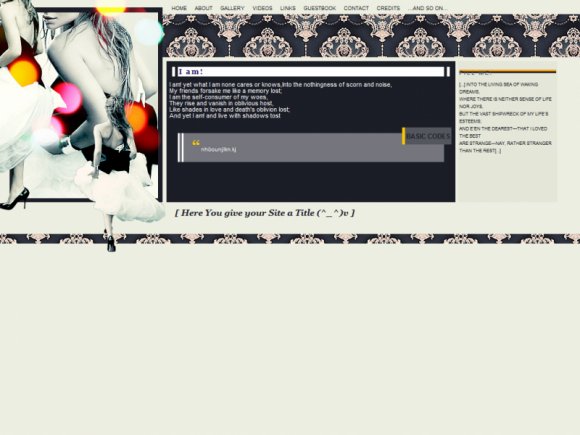
The concept is great, but the style is just a little too blocky for me. The 'basic codes' tag seems out of place, and the font difference in the right hand box and the main area is somewhat confusing and isn't really necessary. The alignment is also a tad wonky, for example the main text is aligned farther left than the header and the 'fill me' header should sit above the orange and white border, not awkwardly on top of it. Also, the victorian background image isn't compatible with 16:9 or 16:10 resolutions.

cute.

Beautiful work!!!!!!

wow, totally amazing! seriously blew me away(:

i'm just in love with your work :)

awesome!

Gorgeous colours & pattern. It looks fantastic.

looks great!

Very Pretty :D!I like the colors.
Good Job!