Layout Comments
Showing latest 6 of 6 comments

I like the colors. Less is more in some cases. =)
By bee24 on Jun 23, 2009 4:09 pm

nice, i like this a lot.
By futura on Jun 22, 2009 5:04 pm

i dont think the fact that its simple is a problem at all, not everyone wants a complicated layout after all (:i think the colours work really work well together.
By SammyTheHeadbutt on Jun 22, 2009 2:11 pm

I like the links, they fit in really well, and the colours are awesome.
By aliiicimo on Jun 21, 2009 1:39 pm

the color is 2 boring. its way 2 simple...
but if i wanted "simple" really good job ^-^
By xxMikaylaMonsterxx on Jun 20, 2009 8:53 pm

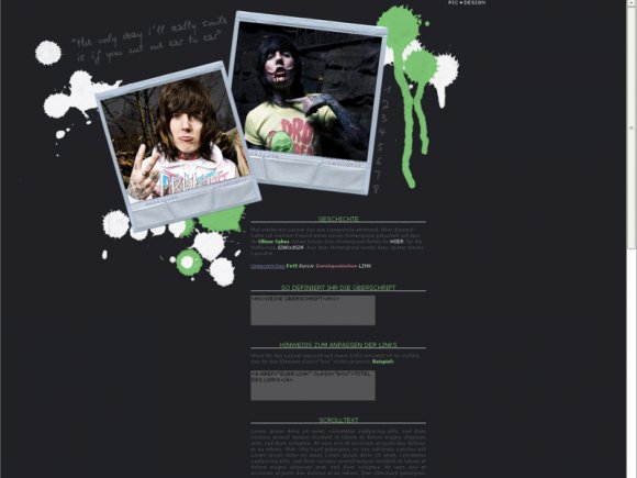
Looks pretty good but something about the green splats in the top right corner looks strange to me. :| Otherwise, good job.
By Mikeplyts on Jun 20, 2009 7:53 pm
Layout Details
| Designer |
TheHopeleSsKiD
|
| Submitted on | Jun 19, 2009 |
| Page views | 10,899 |
| Favorites | 17 |
| Comments | 6 |
| Reviewer |
schizo
|
| Approved on | Jun 20, 2009 |
Layout Colors
Layout Tags
celebrities, love, music, oliver, sykes, bring, the, horizon, bring me the horizon, oliver sykes, bmth, oli