Designer's Comments
Look carefully for specific instructions
Please don't delete the credits
Please give any advice on how I can improve!
Thanks you
Please give any advice on how I can improve!
Thanks you
Layout Comments
Showing latest 6 of 6 comments

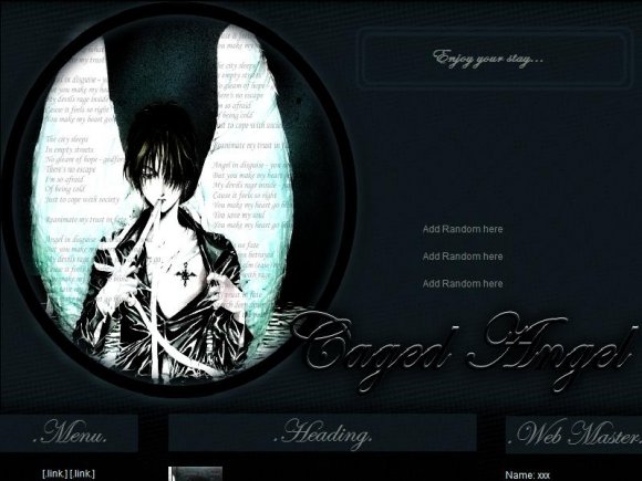
i love the darkness in this design
By res8zenith on Jun 21, 2009 7:16 pm

Tokio, it's NOT a Myspace Layout. It's a website one.
By clwangel on Jun 3, 2009 12:32 pm

I want this as my layout
but I'm confused on where to paste the code and if it has to be 1.0 or 2.0
By TokioSuoh on May 31, 2009 12:36 am

awesome! [:
By dilligrout on May 21, 2009 10:47 am

It's alright but I don't really like the font used in the banner. Otherwise, good job. :)
By Mikeplyts on May 19, 2009 12:31 am

WHOA!Very Neat-Looking(well more then Neat,I just can't think of the word right now xP).I could promise I have seen an image almost like the one in the lyt B4,It's Pretty!Good Job!Keep Up The Great Work(& sowwy 4 the long cmnt - -)
By Snaily on May 19, 2009 12:25 am