Designer's Comments
Look carefully for specific instructions
Please keep the credits intact.
---
Font: Dafont
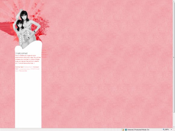
Image: S&T
Brushes: Swimchick
Find this layout and more on my website and on my myspace
Layout Comments
Showing latest 9 of 9 comments

Whoa this is way too thin for my personal preference. You can barely write any content without making it look squished. xD
But I agree, it's quite unique. (:

i actually like the thinness.
good job (:

I don't really like.. how empty it is!
Maybe you should add another content section and use that thin one for nav?

i like the thiness of it...
but the backgrounds abit empty...
xx

Veyr pretty~the thinness is really odd looking but i love it~!

Well I like how thin it is.
It's different, I like different.
(y)

i agree with so-saccastic... great image but the column is too thin and the font for the navi kinda blends into the background

Yeah, it's really thin and I think it could use some more 'oomph', if you know what I mean. Otherwise, good job. :)

I don't really like how thin it is, but the background and header image are very nice. C=
Layout Details
| Designer |
hospitalhorror
|
| Submitted on | May 9, 2009 |
| Page views | 6,374 |
| Favorites | 6 |
| Comments | 9 |
| Reviewer |
schizo
|
| Approved on | May 10, 2009 |