Designer's Comments
Look carefully for specific instructions
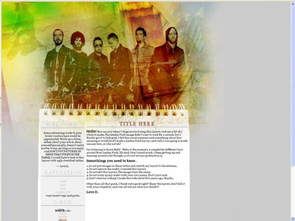
Linkin Park! The texture over the boys is a bit odd, I am aware. I was going about and I decided to go ahead with a little texture, and frankly, nothing ever goes small for me. So over and out, enjoy the amount of color.
----
http://overloaddd.com/
----
http://overloaddd.com/
Layout Comments
Showing latest 4 of 4 comments

I didn't actually like the look of this layout, but as soon as I recognized Chester + Mike + Rob I was like AHHHHHHHHHHHHHHHHHHHHH it's LINKIN PARK. (I have a mega obsession with LP)
By hiddentragedy on Jul 3, 2009 4:20 pm
Ah I like thiss :3
By Eww on Feb 4, 2009 5:19 pm
the textures and colors you used are brilliant.
very well done.
By foundry on Jan 29, 2009 1:09 am
Do you know the font you used for "Linkin Park"? Nice job btw
By none345678 on Jan 28, 2009 10:22 pm
Layout Details
| Designer |
TruthfullyUnwritten
|
| Submitted on | Jan 26, 2009 |
| Page views | 5,577 |
| Favorites | 9 |
| Comments | 4 |
| Reviewer |
manny-the-dino
|
| Approved on | Jan 28, 2009 |


