Designer's Comments
Look carefully for specific instructions
Layout Comments
Showing latest 10 of 12 comments

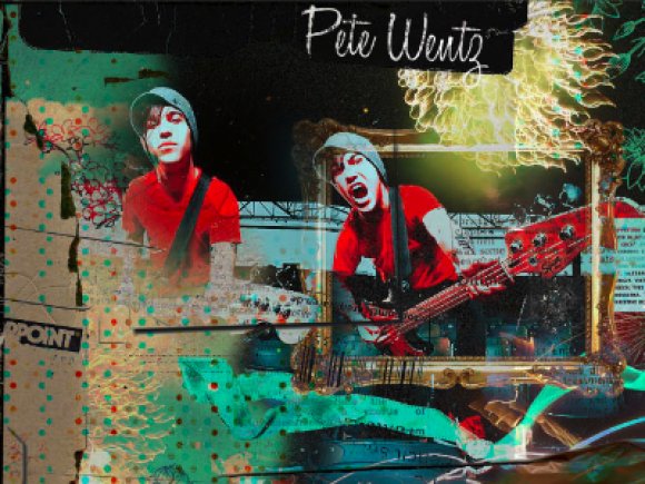
AWESOME DESIGN!! but i think "Pete Wentz" shouldn't be the font you used, it should be different. :]

This is great, but the header should be smaller. then, it would be even BETTER ;)

i really like this. the color chaos around Pete fits...oddly
this would even more awesomeness if it was also a Livejournal layout.

oh my god.
LOVE!

OMG i love!

so nicely done! I like busy, but maybe you could've taken like the bottom 1/3 of the banner out... and I don't think the bottom blue and green flower on the right matches well. otherwise I like it soo much :) another busy person like me, aha!!

woah! that's pretty splendid.

I don't like the brown tape covering the content either. I think the texture bg could've been scaled smaller. The CSS is ok, but a bit boring though (no colors). Still, nice job on the banner with the textures, stock, and cool colors. :D

Make a myspace version please =)

i agree with Schizo. A little busy but somehow it goes well with each other. Although that blue looks soo weird. and the brown packing tape looks off, making the content section look weird. While Pete Wentz is a little over done... but its a nice layout.
Layout Details
| Designer |
staticsongs
|
| Submitted on | Dec 7, 2008 |
| Page views | 4,287 |
| Favorites | 18 |
| Comments | 12 |
| Reviewer |
schizo
|
| Approved on | Dec 7, 2008 |