Designer's Comments
Look carefully for specific instructions
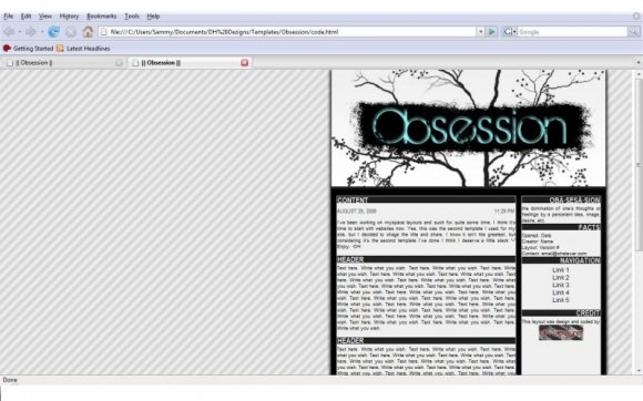
This layout was designed and coded by DH Dezigns.
It is technically the 2nd template I've create, just modified a bit. I used it for awhile on my site and wanted to make it available to others.
I know it isn't the greatest, but give me a break lol. More, better layouts are coming soon ^-^
Hope ya'll like it.
[edit:in the code, if the dots in between obsession turn up as an a then dot replate the dot in the code with & #183; delete the space between & #..]
Layout Comments
Showing latest 4 of 4 comments

so cuteeeeeeeeeeeeeeeeee
pefect for a couple
fave^^
By fadedxstars on Sep 8, 2008 3:58 pm

I agree, it's still ok to the left, though. But the blue is rather odd.
By futura on Aug 30, 2008 2:17 pm

I do agree, But I also kind of like the blue. =] Nice job though
By asinglewhisper on Aug 30, 2008 12:06 pm

I think this would look better centered.
The blue in the banner seems too random; I would have chosen another color.
By tokyo-rose on Aug 30, 2008 10:32 am