Designer's Comments
Look carefully for specific instructions
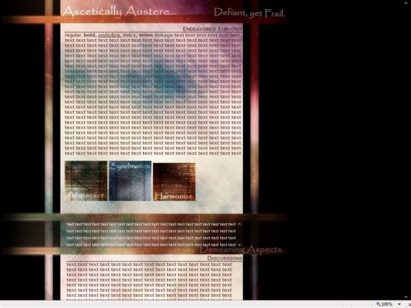
very simple, i was just experimenting & this one just is different from what i normally make, i do mostly anime and nature layouts, this one is under abstract i believe. these new designs are for a more Sophisticated Viewer [Project] (SVP)
-res autumn*sunsets
-res autumn*sunsets
Layout Comments
Showing latest 8 of 8 comments

i like the set out of it.
i dont like the ascetially austere bit though,
and i think it wud be better if u had the navigation at the top instead.
but its simple and i like it,
By zoekidmuch on Sep 20, 2008 5:13 pm

I like the textures. :)
By shadowkissed on Aug 26, 2008 12:20 pm

i don't know but i like all the different css colors being the same, its more simple that way. if i change them around, they won't be that strong as a whole.
By res8zenith on Aug 25, 2008 8:16 pm

Interesting. Great color choices.
By schizo on Aug 25, 2008 7:35 pm

I really love this :)
By SammyTheHeadbutt on Aug 25, 2008 7:09 pm

I love the look of it, but I agree with the font being different colors.
By futura on Aug 25, 2008 6:09 pm

It's too simple for my liking, but you succeeded in getting that "abstract" feel. :]
By dreamgurl36 on Aug 25, 2008 4:16 pm

It would be nice if the bold, italic, and underlined fonts were all different colors.
By tokyo-rose on Aug 25, 2008 4:11 pm
Layout Details
| Designer |
res8zenith
|
| Submitted on | Aug 25, 2008 |
| Page views | 4,791 |
| Favorites | 25 |
| Comments | 8 |
| Reviewer |
jaeminnie
|
| Approved on | Aug 25, 2008 |