Designer's Comments
Look carefully for specific instructions
Do not remove credits or claim as yours.
Layout Comments
Showing latest 2 of 2 comments

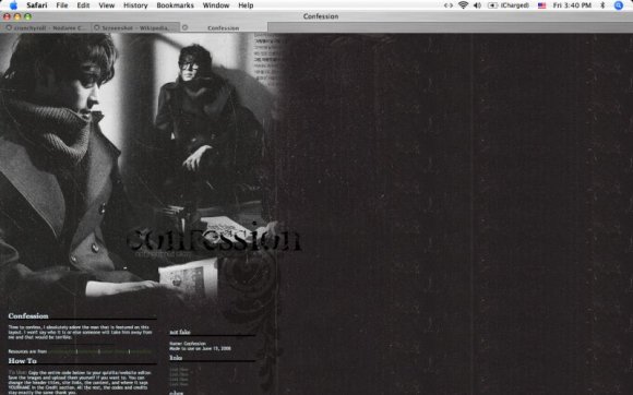
I really like the concept and the images you used, but the graphic altogether looks kind of dull. If you were to up the contrast a tad, It would look a lot more unified. Anyway, you did a good job! :)
By shmuggy on Jun 23, 2008 7:59 am

Old-ish style. Nice. =]
By dreamgurl36 on Jun 23, 2008 6:44 am
Layout Details
| Designer |
ForgiveTheSinner
|
| Submitted on | Jun 20, 2008 |
| Page views | 3,898 |
| Favorites | 10 |
| Comments | 2 |
| Reviewer |
Insurmountable
|
| Approved on | Jun 22, 2008 |