Designer's Comments
Look carefully for specific instructions
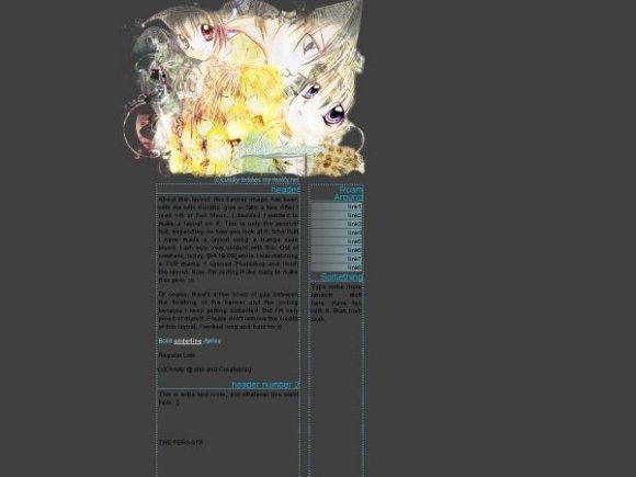
I LOVE this layout.
Make sure you know html & css before you use this layout.
You can change the "headers" to whatever text you want, try not to put too much in the header in the second column. There is only 85 pixels worth of text on one line.
Select all of my specially written for the first time "about this layout", delete it, :'[, and add your own text.
You can delete headers, add headers, as long as you know what you're doing.
I will not provide any help with this, I'm sorry.
Once again, this is only for people who understand and are fluent in html & css
Layout Comments
Showing latest 8 of 8 comments

I love Full Moon. =] This layout's a bit too narrow for my personal liking, but yup, cute banner!
By dreamgurl36 on Apr 22, 2008 3:47 pm

Don't think the blue works very well at all. I think it would have looks much better if it was the same color as the "full moon" text.
Great banner, btw.
By futura on Apr 21, 2008 1:35 am

i like the banner and the dark color but i dont like any of the content or navi. those blue dots are annoying
By hiimeka on Apr 20, 2008 2:07 am

i love the banner. and i like how it works well with the grey background.
By aaayotiffany on Apr 20, 2008 1:41 am

The banner is great.
By tokyo-rose on Apr 20, 2008 1:35 am
very cute
By lancedamien on Apr 19, 2008 11:16 pm
this is ABSOLUTELY PERFECT!
:DD
By sora-is-my-hero on Apr 19, 2008 10:26 pm

For some reason, I DRAWN TO THIS D:
By IBangBaby on Apr 19, 2008 9:42 pm
Layout Details
| Designer |
Christy
|
| Submitted on | Apr 19, 2008 |
| Page views | 7,825 |
| Favorites | 27 |
| Comments | 8 |
| Reviewer |
Dominatrix
|
| Approved on | Apr 19, 2008 |