Layout Comments
Showing latest 10 of 10 comments

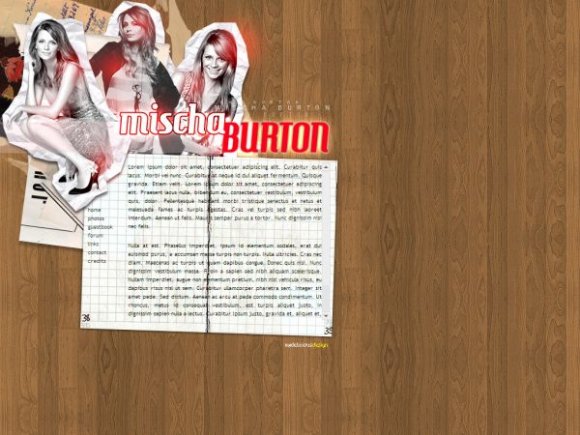
i like the wood panels in this.
outside of the name being spelled wrong, the layout looks nice but that black line in the 'paper' makes the text on top hard to read.
maybe instead of making that section as big as it is, try splitting it so that the page rip acts like two sheets of paper for two different content div layers.
This is such an inspiring layout. :)
It's great. But it's BARTON ; with an A. :)
i don't really know much about mischa barton but i like how you put this together.
great layout.
Yeah, it's "Barton." The navigation should stand out more by being bigger and maybe a different font face. Pretty good layout.
really nice
Oh man I love Mischa Barton!
And this is a cool template, if only u spelled her last name right :P
Although the last name is mispelled, it`s really nice.
This is a decent layout and I love Mischa Barton. I also believed you spelled her name wrong, it's Barton. xD
Great layout.
Layout Details
| Designer |
delicioustyle
|
| Submitted on | Mar 28, 2008 |
| Page views | 4,458 |
| Favorites | 8 |
| Comments | 10 |
| Reviewer |
Relentless
|
| Approved on | Mar 28, 2008 |


