Designer's Comments
Look carefully for specific instructions
Please read paragraph on layout for rules. Thanks.
Layout Comments
Showing latest 6 of 6 comments

cool but i think you could've done a better job on the banner
By x-one2three on Jun 28, 2009 4:26 am

Even though I don't like her, I like how you organized everything. Nice.
By umbreon on Jan 24, 2008 9:27 pm

looks nice, although some of the brush splatters could of been erased on her face. Also the screen shot makes it looks soo much smaller then it really is, my screen resolution is 1200x800 and its huge, perhaps taking a screen shot of at least that size resolution so the preview has more detail.
By Blaqheartedstar on Jan 20, 2008 12:23 am

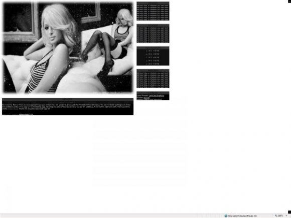
Oh wow the gray-scale makes the pics look gorgeous =]
By sweetalacrity on Jan 19, 2008 11:32 pm

The banner is too plain.
By tokyo-rose on Jan 19, 2008 10:44 pm

Don`t really like the graphic much, but the layout is unique.
Kudos. :)
By futura on Jan 19, 2008 10:40 pm
Layout Details
| Designer |
lovedagraphics
|
| Submitted on | Jan 19, 2008 |
| Page views | 7,378 |
| Favorites | 10 |
| Comments | 6 |
| Reviewer |
libertie
|
| Approved on | Jan 19, 2008 |