Designer's Comments
Look carefully for specific instructions
Layout Comments
Showing latest 10 of 13 comments

i like this layout :D

and actually the only difference I see in IE is there is a set off problem. so the code is just probably in a wrong spot, god i love code errors.. not.
There obviously is a way to correct the error although you would need to fix your options for whomever is viewing your website, and there definitely is a fix out there like that for this.. do a little digging. :P
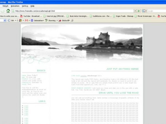
Hey, was just wondering - I'd love to use the layout for my RPG's website, but I'd need to change the image at the top, and the green to blue - would you be ok with me doing that? I'd still leave all the credit there, but if you're not ok with it just let me know, I'll understand. ^_^ Awesome layout btw.
It reminds me of You in an odd sort of way .. I loves it though
I like that it looks so simple and clean in a peaceful way. I love this ;)

I love the image

The picture is really nice :) calm. Haha, "Name: Harry Potter?"

Thanks guys :)
I like the big gap. Well, I like it in Firefox. That's why it's there. o.O
It looks sort of dumb in IE where it's twice as big, though. >_>
Oh, this is nice!
Layout Details
| Designer |
avocadosnap
|
| Submitted on | Jan 2, 2008 |
| Page views | 11,147 |
| Favorites | 70 |
| Comments | 13 |
| Reviewer |
freeflow
|
| Approved on | Jan 2, 2008 |