I'd Give it all Away to Have You (comments)
Displaying 1 - 19 of 19 comments

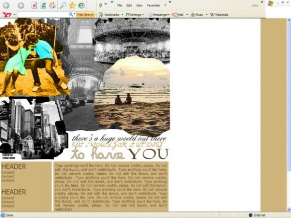
P.S. The only thing is that it's like you didn't bland the images. I guess that was done on purpose. Maybe it's the fact that they're NOT blended is part of what makes the layout stand out more. It's nice.
This is very good. Interesting concept and idea. I like this.


Ha, she even left your credit on. I just found that funny.
Hey, someone stole this layout and a lot of others, including mine, from CreateBlog. Here's the link:
http://blogskins.com/ screenshot/184905


hey do you by chance make myspace div layouts cause i love this layout and was wondering if you could make a myspace div


I don't like it. I'm sorry but I don't want to sugar coat it. One thing that brothers me is the header, you could of blended it. The links are hard to see and you could of did more with the navigation too so it stands out. I like the message of the layout, it's cute. But when you make your next layout think about those things.


pretty nice , i just think the headers and stuff could be a little more elaborate


it's decent. Nothing really good or bad about it. I do like the colors though :]

Add Comment
You must be logged in to comment
Layout Details
| Designer |
ilovedanielradcliffe
|
| Submitted on | Jul 30, 2007 |
| Page views | 24343 |
| Favorites | 123 |
| Comments | 19 |
| Reviewer |
karmakiller
|
| Approved on | Jul 30, 2007 |