Designer's Comments
Look carefully for specific instructions
Layout Comments
Showing latest 8 of 8 comments

oh... I thought that you desubmitted this one..

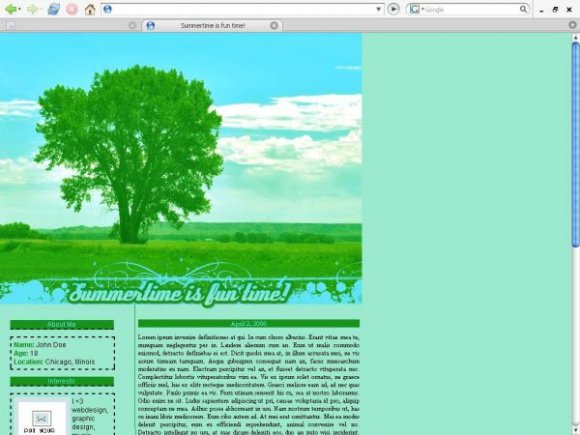
The colors are summertime colors, if I used any other colors then they WOULD NOT match the image and that would look bad. But thanks everyone for the criticism. Oh, and I removed the black dotted lines. :D

I also agree with Mark..the colors are a little odd? But other than that, this layout is really organized and well done =)

I like it but when viewed in Firefox it is not centered.

Yeah, the dotted lines actually do look a bit out of place...but it's still amazing.

I really love the header of the layout, especially the picture of the tree and the font you used for the title. I'm just not all that fond of the main colors you used for the layout. Another thing I find odd about it are the black dashed borders in the left column. Good job though.

It's pretty but I'm not feeling the dotted lines :( They look out of place
Wow, I seriously like this so much!
It's so clean, yet pretty. I love the colors and the image.
*clap*
!
:D
Layout Details
| Designer |
YourSuperior
|
| Submitted on | Jun 4, 2007 |
| Page views | 10,053 |
| Favorites | 24 |
| Comments | 8 |
| Reviewer |
digitalfragrance
|
| Approved on | Jun 4, 2007 |