Layout Comments
Showing latest 8 of 8 comments

lovleh. but can you make one for myspace?
but of course you don't have to. x)

I think you could of did more with the header and the whole set up of the layout

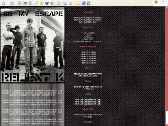
I like the theme of this layout, and the grayscale colors.

I think it's a little boring

I really like the color scheme and idea for this layout! I love Jon and John in that picture too...haha.
I'd probably use this layout if you fixed the few things everyone else mentioned and made it for Myspace or Livejournal. =D

I love this! You should make a similar one for myspace. :)

i agree on the background... it makes it harder to read the nav panel... and yes the left side content background is a bit over used... more could be done with this layout... it really looks like u gave up on it

i dont really like the backgrounds.. for the main or menu..
menu - reading the text is a bit difficult
main - i personally just hate those kind of backgrounds..
keep up the good work, though!