Layout Comments
Showing latest 4 of 4 comments

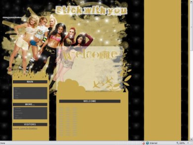
the background looks weird... looks like theres room for another text layer...
pictures blurry and the welcome box... whats that about? does the person write something in there?
By Blaqheartedstar on Jun 8, 2007 3:39 pm

The banner looks great!
By YourSuperior on Jun 3, 2007 9:24 pm

It's a little thrown together but I love the idea
By FoxLucky on Jun 3, 2007 7:23 am

i love the little citie above the navigation:]
but the psd is kinda' like, blurry
the random fade behinde "welcome" wasnt needed at all..
By Chicago on May 28, 2007 8:17 pm
Layout Details
| Designer |
lovedagraphics
|
| Submitted on | May 26, 2007 |
| Page views | 9,418 |
| Favorites | 4 |
| Comments | 4 |
| Reviewer |
micron
|
| Approved on | May 28, 2007 |