::Aloha:: (comments)
Displaying 1 - 12 of 12 comments

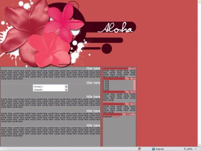
I love the gray and pink contrast! It's very "hip."


i don't like the gray bg in the tables, but i do like the header a lot.

It's pretty cute, I don't like the grey though. But everything else looks nice.


erm i couldnt tell you where i got the far back one, the circular looking one, the splat ones i got from retro-bella.net and the flowers are brushes i made :)

This is definitely a good layout. The flowered banner at the top looks really cool. I really like the brushes you used, where'd you get them?
lol how can i sexy it up more?? ive got this on my personal site too for people to use so i can alter it there!! what do you mean? :):)


Hmm, I love the left side of the banner, but not the right side of it. Lol. The content area looks a little crowded and clumped, and I think you could've sexied-up the nav a bit more.
Add Comment
You must be logged in to comment
Layout Details
| Designer |
sheertalentx
|
| Submitted on | Apr 30, 2007 |
| Page views | 17786 |
| Favorites | 48 |
| Comments | 12 |
| Reviewer |
digital.fragrance
|
| Approved on | Dec 31, 1969 |