Designer's Comments
Look carefully for specific instructions
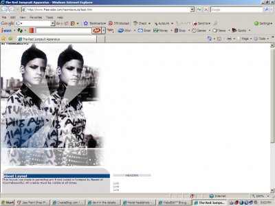
About Layout
This layout ft Omahyra Mota, a Dominican model and actress. Note: You must know basic html
Anyhoo enjoy :)
Layout Comments
Showing latest 8 of 8 comments

It is a website

This looks more like a website than a myspace. I do agree with mark, you could have done much more with the header! :)

hm.. it could be better.it sits at "alright"
I agree also, I don't like how I coded it, but i guess it is too late, you think?

QUOTE(The Markster @ Apr 15 2007, 3:15 PM) [snapback]2531077[/snapback]This one's alright, but you could've done a lot more on the header. As for the navigation, I personally think it would look better if they all had background colors on

First of all, I commend you for using Omahyra. She happens to be one of my favorite models. Though, I also agree with The Markster.

i agree with mark, not tooo fond of the cursor on the fonts... maybe cuz its a tad over used...

This one's alright, but you could've done a lot more on the header. As for the navigation, I personally think it would look better if they all had background colors on hover, rather than having it alternate.