Designer's Comments
Look carefully for specific instructions
Layout Comments
Showing latest 10 of 10 comments

It's very pretty, and resizes *okay* compared to lots I've seen up here.
However, if you're smaller than 1024x, the sidebar creates a float drop, and it looks dumb when the sidebar is below the text. Try absolute positioning with a flexible width, perhaps? (e.g width:XX%;)
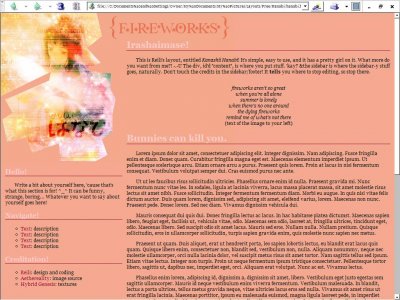
Love what you did with the girl, it looks so pretty and.. I don't know.. sparkly, heavenly.

graphics are great

Really like this, I love the little graphic and I like how the content is set up ^Yea firefox seems to have a weird alignment problem with Reili's layouts.

QUOTEpoised' date='Jan 21 2007, 11:24 PM' post='2427253'] Hm... is that Latin in the text? Haha. It's dummy text. One thing I don't like about the image is that it doesn't blend into the background. The cut-out edges sort
Hm... is that Latin in the text? Haha.

QUOTE(miceylulu @ Jan 15 2007, 2:45 PM) [snapback]2417119[/snapback]I really don't like this one. It's too simple and for me the banner is behind the text, so, eehhhh...What do you mean "The banner is behind the text"? Anyways,

love the image, a tad tooo plain but the image on the left is awesome

very pretty layout i like it a lot

I really like this. (The sidebar is misaligned for me though)

I really don't like this one. It's too simple and for me the banner is behind the text, so, eehhhh...
Layout Details
| Designer |
talcumpowder
|
| Submitted on | Jan 14, 2007 |
| Page views | 8,966 |
| Favorites | 25 |
| Comments | 10 |