Evanescence (comments)
Displaying 1 - 13 of 13 comments


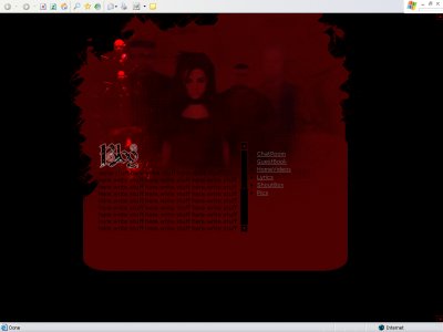
well it sucks that it doesn't work on firefox.... and yeah the text is hard to read.. and the image is tooo dark

just because not everyone uses firefox, doesnt mean NO ONE does. It'd be nice to have it available for other browsers. Otherwise its a nice layout, if a bit dark.

QUOTE(Fabio. @ Aug 12 2006, 8:10 PM) [snapback]2232315[/snapback]But it's most likely quite easily fixed to work in FF. Why code for only a part of the internet world?Anyhow, I'm in a cynical mood today, don't mind me.Because there is
I have been a very big fan of evanescence for a while now. This is a great layout, but it's a bit tad two dark, I can barely see it on my screen and I have my brightness cranked up there. Your div layers seem to be a bit off as well. Great job on the
But it's most likely quite easily fixed to work in FF. Why code for only a part of the internet world?Anyhow, I'm in a cynical mood today, don't mind me.
And I quote from Designers Comments:QUOTEDesigned for internet explorer! Will not work in FF. Mighty fine coding we are accepting now days.
[thumb]http://img97.imageshack.us/img97/2351/layoutxs8.jpg[/thumb]That, with the exception of my screenshot widget, is what I see using Firefox. In internet explorer, the main layer is off. Man, this is some good coding that createblog is accepting nowada
Your div layers are off. This layout wouldn't work for every resolution and the text is a bit hard to read.I like the concept and overall look though =D
Add Comment
You must be logged in to comment
Layout Details
| Designer |
sarahcastro
|
| Submitted on | Aug 10, 2006 |
| Page views | 21548 |
| Favorites | 11 |
| Comments | 13 |
| Reviewer |
brownsugar
|
| Approved on | Dec 31, 1969 |