
Designer's Comments
Look carefully for specific instructions
Click my profile to view the PINK version.
Using This Graphic
Copy and paste one of the code below
URL Link - Email & IM
HTML - Websites & Blogs
BBcode - Forums & Bulletin Boards
Save File - My Computer
Right click and Save Target As...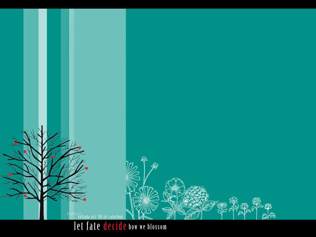
Graphic Comments
Showing latest 5 of 5 comments

i like this one better. :)
By ekiina on Jun 25, 2008 6:24 pm

I like the blueish color and the text, but the clash of red just doesn't do it for me, not with blue. Over all though, it's a very nice graphic.
By IzzyGrace on Jun 18, 2008 9:41 pm

i like the blue better. because i love blue, lol. but the text is kind of out of place.
By aaayotiffany on Jun 17, 2008 1:33 am

Cute, but I don't really like the placement of the font or the font itself. The colors of the background are nice, though. [:
By futura on Jun 17, 2008 1:25 am

I like the message. C= Nice color scheme, also.
By CapCaDancer on Jun 17, 2008 12:43 am
Graphic Details
| Designer |
BlueCrystalBlaze
|
| Submitted on | Jun 16, 2008 |
| Page views | 3,511 |
| Favorites | 22 |
| Comments | 5 |
| Dimensions | 1024 x 768 |
| Reviewer |
manny-the-dino
|
| Approved on | Jun 17, 2008 |