Tutorial
Click on thumbnailed images to enlarge
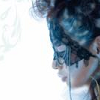
1. Find a base. This will be mine:
2. Duplicate it and set it to screen at 70%. Duplicate the base again and set it to luminosity at 100%.
3. Create a new layer and fill it with #DBFBFF. Set that layer to color burn at 100%.
4. Create another layer and fill it with #FFE1C8. Set that layer to multiply at 100%.
5. Create a selective coloring layer. Layers >> New Adjustment Layer >> Selective Coloring.
Reds: -100, +25, +100, 0
Yellows: +100, 0, -40, 0
Whites: +100, -5, -50, 0
Neutrals: -10, 0, -6, 0
6. Now, create a curves layer. Layers >> New Adjustment Layer >> Curves.
First point: In(126), Out(153)
Second point: In(173), Out(193)
7. Create a hue/saturation layer. Layers >> New Adjustment Layer >> Hue/Saturation.
Saturation +20
8. Create another selective coloring layer.
Reds: -15, 0, 0, 0
Whites: +100, 0, -100, 0
9. Finally, create a Brightness/Contrast layer.
Brightness -10
Contrast +5
Optional Step: If you're not satisfied with your icon, feel free to add various textures, adjustment layers, etc etc. to make your icons pretty.
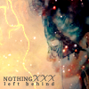
This is my result:
Hope this tutorial helps C: If you have any questions, feel free to ask.
2. Duplicate it and set it to screen at 70%. Duplicate the base again and set it to luminosity at 100%.
3. Create a new layer and fill it with #DBFBFF. Set that layer to color burn at 100%.
4. Create another layer and fill it with #FFE1C8. Set that layer to multiply at 100%.
5. Create a selective coloring layer. Layers >> New Adjustment Layer >> Selective Coloring.
Reds: -100, +25, +100, 0
Yellows: +100, 0, -40, 0
Whites: +100, -5, -50, 0
Neutrals: -10, 0, -6, 0
6. Now, create a curves layer. Layers >> New Adjustment Layer >> Curves.
First point: In(126), Out(153)
Second point: In(173), Out(193)
7. Create a hue/saturation layer. Layers >> New Adjustment Layer >> Hue/Saturation.
Saturation +20
8. Create another selective coloring layer.
Reds: -15, 0, 0, 0
Whites: +100, 0, -100, 0
9. Finally, create a Brightness/Contrast layer.
Brightness -10
Contrast +5
Optional Step: If you're not satisfied with your icon, feel free to add various textures, adjustment layers, etc etc. to make your icons pretty.
This is my result:
Hope this tutorial helps C: If you have any questions, feel free to ask.
Tutorial Comments
Showing latest 3 of 3 comments

awesomeeeeeee.
By futura on Nov 18, 2008 2:51 am

this is way sexy!
By diputs on Nov 12, 2008 12:48 am

The outcome looks incredible. =o
I'll be sure to try it out soon.
By so-sarcastic on Nov 10, 2008 5:16 pm