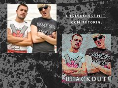
Tutorial
Click on thumbnailed images to enlarge
This tutorial will show you how to make a funky icon.
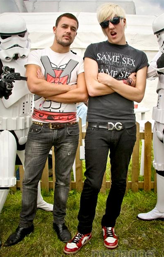
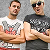
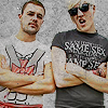
I'm using this wonderful picture of Gavin and Sean of The Blackout:
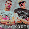
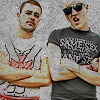
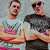
And we're going to turn that into this:
So let's do it.
Open your picture.
REMEMBER that all colour techniques work differently with each image: You have to play around to get what you're looking for.
This is what works with MY images, so you should know what you're doing to use this tutorial.
01 Crop, cut-out & touch up;
Mmkay, so for this icon, you'll need to cut out your figure(s).
To do this, I normally use the Polyagonal Lasso Tool, although you can use the Magnetic Lasso.
I zoom in to about 400%, and click around my figures, normally deleting sections as I go, as I find this easier:
This does take a long time, so be patient. It always works out best at the end.
After you've cut out your figure, you should have something like this:
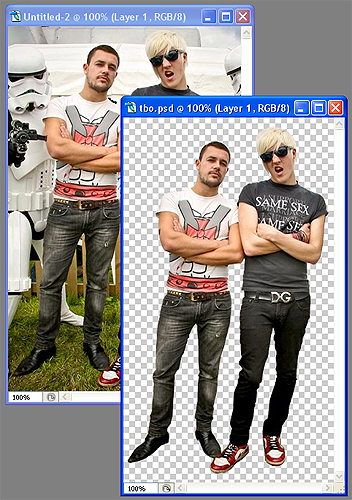
You should SAVE THIS before you continue, because it probably took a while, and if you do something wrong and can't undo it, you'll kick yourself.
Just save it as a PSD.
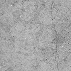
open a new window, 100 by 100 pixels.
Copy and paste this texture into it:
Take your PSD and paste it into your new window.
Shrink it down to size and place it where you like in your icon.
Because you shrunk it down so small, you will probably need to sharpen it.
Filter > Sharper > Sharpen should do, but you may need to do this a couple of times.
I did mine once, and then used a small sharpener tool on the faces & shirt detail.
Gavin and Sean now look like this:
02 Darken & Lighten;
Okay, so before we continue you need to bring out some of the shades in your subjects.
Using the BURN TOOL, I bring out the darker shades in my image.
I zoomed right in and used a small brush to bring out facial features and shirt detail.
Using the DODGE TOOL, I bring out the lighter shades in my image.
Again, I zoomed right in and used a small brush to bring out the lighter shirt details, as well as Sean's hair and their arms.
Now I duplicate (CTRL+J) this image, and hide the top copy for now.
Set the bottom layer to DARKEN. This will give this effect to your image:
Now, show your top copy, and set this to lighten, at about 30% opacity. You can play with this depending on how extreme you want the effect.
Sharpen this layer again for a stronger looking image.
Save this as a PSD for now, as you may now make some changes you don't like.
03 Colour;
Layers > New Adjusment Layer > Selective Color.
red: -7, +41, -55, -12
yellow: 0, 0, +55, 0
whites: +30, 0, 0, 0
neutrals: -7, 0, 0, 0
Layers > New Adjusment Layer > Brightness & Contrast.
Brightness: -7
Contrast: +15
This is what Gavin & Sean look like now:
04 Brushes;
Here, I used some splatter brushes by icechicken. Her brushes are an excellent download, I use them in everything...
I used a mid-grey colour, and on a new layer, I splattered on these brushes, avoiding any facial areas and sticiing to the sides as much as possible.
I sharpened this layer as the brushes are small, and sometimes look blurry on icons.
I then set this layer to screen, at about 65-70%.
Finally, I added text.
This is what the boys looks like now:
You now have your final product. Save For Web > Save as PNG for best quality, especially if you have used text.
I'm using this wonderful picture of Gavin and Sean of The Blackout:
And we're going to turn that into this:
So let's do it.
Open your picture.
REMEMBER that all colour techniques work differently with each image: You have to play around to get what you're looking for.
This is what works with MY images, so you should know what you're doing to use this tutorial.
01 Crop, cut-out & touch up;
Mmkay, so for this icon, you'll need to cut out your figure(s).
To do this, I normally use the Polyagonal Lasso Tool, although you can use the Magnetic Lasso.
I zoom in to about 400%, and click around my figures, normally deleting sections as I go, as I find this easier:
This does take a long time, so be patient. It always works out best at the end.
After you've cut out your figure, you should have something like this:
You should SAVE THIS before you continue, because it probably took a while, and if you do something wrong and can't undo it, you'll kick yourself.
Just save it as a PSD.
open a new window, 100 by 100 pixels.
Copy and paste this texture into it:
Take your PSD and paste it into your new window.
Shrink it down to size and place it where you like in your icon.
Because you shrunk it down so small, you will probably need to sharpen it.
Filter > Sharper > Sharpen should do, but you may need to do this a couple of times.
I did mine once, and then used a small sharpener tool on the faces & shirt detail.
Gavin and Sean now look like this:
02 Darken & Lighten;
Okay, so before we continue you need to bring out some of the shades in your subjects.
Using the BURN TOOL, I bring out the darker shades in my image.
I zoomed right in and used a small brush to bring out facial features and shirt detail.
Using the DODGE TOOL, I bring out the lighter shades in my image.
Again, I zoomed right in and used a small brush to bring out the lighter shirt details, as well as Sean's hair and their arms.
Now I duplicate (CTRL+J) this image, and hide the top copy for now.
Set the bottom layer to DARKEN. This will give this effect to your image:
Now, show your top copy, and set this to lighten, at about 30% opacity. You can play with this depending on how extreme you want the effect.
Sharpen this layer again for a stronger looking image.
Save this as a PSD for now, as you may now make some changes you don't like.
03 Colour;
Layers > New Adjusment Layer > Selective Color.
red: -7, +41, -55, -12
yellow: 0, 0, +55, 0
whites: +30, 0, 0, 0
neutrals: -7, 0, 0, 0
Layers > New Adjusment Layer > Brightness & Contrast.
Brightness: -7
Contrast: +15
This is what Gavin & Sean look like now:
04 Brushes;
Here, I used some splatter brushes by icechicken. Her brushes are an excellent download, I use them in everything...
I used a mid-grey colour, and on a new layer, I splattered on these brushes, avoiding any facial areas and sticiing to the sides as much as possible.
I sharpened this layer as the brushes are small, and sometimes look blurry on icons.
I then set this layer to screen, at about 65-70%.
Finally, I added text.
This is what the boys looks like now:
You now have your final product. Save For Web > Save as PNG for best quality, especially if you have used text.
Tutorial Comments
Showing latest 3 of 3 comments

this sooo helped me. thanks SO MUCH.
By x-thnksfrthmmrs-x on Jul 16, 2009 7:22 pm

awesome
By forgetit on Jun 12, 2009 6:48 pm

very easy and nice. =] I love it!
By jasminemr on Jun 1, 2009 4:06 pm
Tutorial Details
| Author |
aliiicimo
|
| Submitted on | May 31, 2009 |
| Page views | 5,624 |
| Favorites | 16 |
| Comments | 3 |
| Reviewer |
manny-the-dino
|
| Approved on | Jun 1, 2009 |