Tutorial
Click on thumbnailed images to enlarge
Icon Tutorial
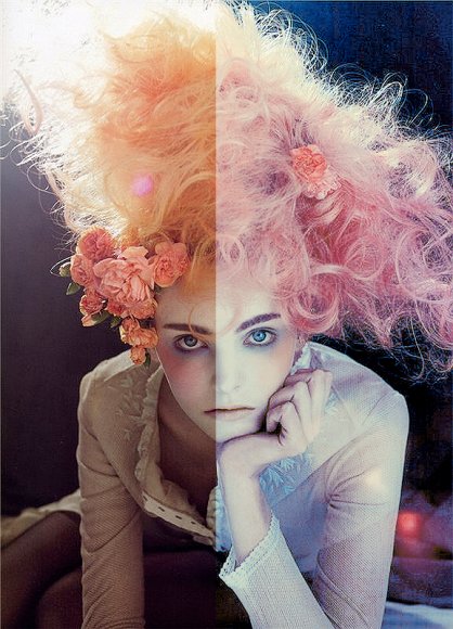
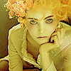
1. Obtain base
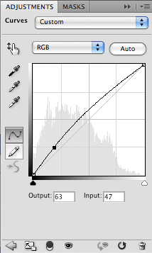
2. New Curves Layer (Layer >> New Adjustment Layer >> Curves)
Use the following settings:
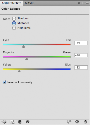
3. New Color Balance Layer (Layer >> New Adjustment Layer >> Color Balance)
Use the following settings:
4. Create new layer, fill with #f0f23f and set to Soft Light. Yes, this is going to make your icon rather yellow, but it'll balance out eventually.
5. Create a new Selective Color Layer (Layer >> New Adjustment Layer >> Selective Color). Use the following settings:
Reds:
C: -100
M: +100
Y: +100
K: 0
Yellows:
C: 0
M: 0
Y: -100
K: 0
Greens:
C: +100
M: +100
Y: +100
K: -100
Cyans:
C: +100
M: 0
Y: +100
K: 0
Whites:
C: +100
M: +100
Y: -2
K: 0
Neutrals:
C: +19
M: -51
Y: -51
K: 0
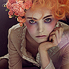
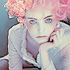
This layer gives a dramatic result, delivering this:
6. Now I feel that the icon just needs a little more, so I create another Selective Coloring layer, and use these settings:
Reds:
C: +100
M: -61
Y: 0
K: 0
Yellows:
C: 0
M: 0
Y: -100
K: 0
Cyans:
C: +100
M: +100
Y: -41
K: 0
Magentas:
C: +100
M: +100
Y: +100
K: +100
Blacks:
C: +7
M: 0
Y: 0
K: 0
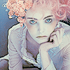
7. It still needs something else, so I added a new layer and filled it with #c8f3f8 and set it to Color Burn.
8. Finally, I created another layer, filled it with #f8c8d1 and set it to Color Burn as well, to give us our final product!
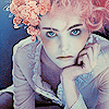
Voila!
1. Obtain base
2. New Curves Layer (Layer >> New Adjustment Layer >> Curves)
Use the following settings:
3. New Color Balance Layer (Layer >> New Adjustment Layer >> Color Balance)
Use the following settings:
4. Create new layer, fill with #f0f23f and set to Soft Light. Yes, this is going to make your icon rather yellow, but it'll balance out eventually.
5. Create a new Selective Color Layer (Layer >> New Adjustment Layer >> Selective Color). Use the following settings:
Reds:
C: -100
M: +100
Y: +100
K: 0
Yellows:
C: 0
M: 0
Y: -100
K: 0
Greens:
C: +100
M: +100
Y: +100
K: -100
Cyans:
C: +100
M: 0
Y: +100
K: 0
Whites:
C: +100
M: +100
Y: -2
K: 0
Neutrals:
C: +19
M: -51
Y: -51
K: 0
This layer gives a dramatic result, delivering this:
6. Now I feel that the icon just needs a little more, so I create another Selective Coloring layer, and use these settings:
Reds:
C: +100
M: -61
Y: 0
K: 0
Yellows:
C: 0
M: 0
Y: -100
K: 0
Cyans:
C: +100
M: +100
Y: -41
K: 0
Magentas:
C: +100
M: +100
Y: +100
K: +100
Blacks:
C: +7
M: 0
Y: 0
K: 0
7. It still needs something else, so I added a new layer and filled it with #c8f3f8 and set it to Color Burn.
8. Finally, I created another layer, filled it with #f8c8d1 and set it to Color Burn as well, to give us our final product!
Voila!
Tutorial Comments
Showing latest 9 of 9 comments

i love it on that image. but i tried it on my own image and it didn't turn out how i expected. it was very, very blue. Oh well. Amazing tutorial.
By emileeexhale on Jul 25, 2009 8:03 am

that looks beautiful~ ^^
i can't wait to try it! haha ^^
By xchangminniex on Jun 18, 2009 8:40 pm

awesomeness.
By futura on Feb 5, 2009 7:30 pm

oh , cool . :)
By liiinda- on Jan 30, 2009 5:48 pm

waah, really nice!
i love the effect on the model.
By Mizuro on Jan 29, 2009 5:21 am

i used it and it's reaaally cool
By lolavonlust on Jan 27, 2009 11:55 pm

This is a cool design . I can't wait to try it out .
By joshgutier on Jan 25, 2009 10:01 am

sweet. definitely going to try this out
By Tomates on Jan 24, 2009 5:53 pm

Very nice!
I'd love to try it!
Unfortunately, I have a crap version of Photoshop (Adobe Elements 3.0), and it doesn't have selective coloring OR curves.
But, I still like the effect!!
By Z0MGsz on Jan 24, 2009 5:19 pm
Tutorial Details
| Author |
technicolour
|
| Submitted on | Jan 24, 2009 |
| Page views | 19,663 |
| Favorites | 144 |
| Comments | 9 |
| Reviewer |
manny-the-dino
|
| Approved on | Jan 24, 2009 |