
Tutorial
Click on thumbnailed images to enlarge
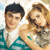
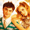
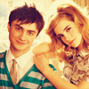
How to turn this: 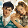 to this:
1. We'll start off by opening an image. I used an image of the amazing Daniel Radcliffe and Emma Watson, courtesy of here. Crop it to your liking. I think this coloring tutorial works best with high quality celebrity photoshoot photos with a bright background. To avoid confusion, try using the same image that I'm using.
2. Duplicate your base. Now set the first copy ("Layer 1 copy" or "Background copy") to Screen at 60% opacity. If your picture is already bright, you can lower the opacity. Make sure it's in between 20% to 70%. This basically brightens up your picture, you'll also see why in the next step.
>> 
3. Duplicate your base one more time. Drag it all the way to the top and set it to Soft Light at 60%. This adds some contrast to your image, and the screen we did in the last layer helps tone it out.
 >>
>> 
4. Go to Layer >> New Fill Layer >> Solid Color. Choose #ffcc99 and set to Soft Light at 100% opacity.
 >>
>> 
This starts the icon off with a cool tan tint.
5. Go to Layer >> New Fill Layer >> Solid Color. Choose #ab3922
and set to Soft Light at 100% opacity.
 >>
>> 
Now we've warmed up the tan tint with a darker color.
6. Go to Layer >> New Fill Layer >> Solid Color. Choose #1621ff and set to Exclusion at 20% opacity.
 >>
>> 
Added a hint of blue.
7. Go to Layer >> New Fill Layer >> Solid Color. Choose #189140 and set to Soft Light at 60% opacity.
 >>
>> 
Green touches added to the icon.
8. Go to Layer >> New Adjustment Layer >> Hue/Saturation. The Hue/Saturation window will pop up. Follow my settings:
Hue: 0
Saturation: -13
Lightness: 0
 >>
>> 
Tone out the green and blue tints to a minimum. You'll also see why in the next step.
9. Go to Layers >> Adjustment Layers >> Channel Mixer. The Channel Mixer window will pop up. Follow my settings:
Output Channel: Red
Red: +118
Green: -38
Blue: +10
Output Channel: Green
Red: 0
Green: +100
Blue: 0
Output Channel: Blue
Red: 0
Green: -8
Blue: +110
 >>
>> 
We then added more green tint. The last step helped neutralized this color.
10. Go to Layers >> Adjustment Layers >> Color Balance. The Color Balance window will pop up. Follow my setting:
Midtones: +37 -18 +9
Shadows: -13 +11 +24
Highlights: +18 -12 +13
>> 
Added some red to the green and blue colors.
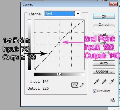
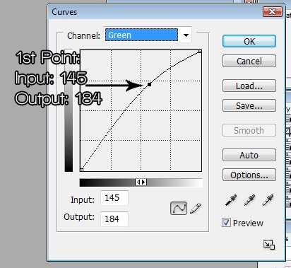
11.Go to Layers >> Adjustment Layers >> Curves. The Curves window will pop up.To make a point, press anywhere in the grid, and put the numbers in the little white boxes that appear in the bottom of the grid. Follow my settings:
Channel: RGB
NONE
Channel: Red
Channel: Green
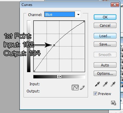
Channel: Blue
This brigtens up the red.
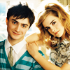
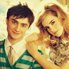
Your Final Icon:
Other Results using different pictures:


More Sweet Tutorials?
to this: 1. We'll start off by opening an image. I used an image of the amazing Daniel Radcliffe and Emma Watson, courtesy of here. Crop it to your liking. I think this coloring tutorial works best with high quality celebrity photoshoot photos with a bright background. To avoid confusion, try using the same image that I'm using.
2. Duplicate your base. Now set the first copy ("Layer 1 copy" or "Background copy") to Screen at 60% opacity. If your picture is already bright, you can lower the opacity. Make sure it's in between 20% to 70%. This basically brightens up your picture, you'll also see why in the next step.
>> 3. Duplicate your base one more time. Drag it all the way to the top and set it to Soft Light at 60%. This adds some contrast to your image, and the screen we did in the last layer helps tone it out.
>> 4. Go to Layer >> New Fill Layer >> Solid Color. Choose #ffcc99 and set to Soft Light at 100% opacity.
>> This starts the icon off with a cool tan tint.
5. Go to Layer >> New Fill Layer >> Solid Color. Choose #ab3922
and set to Soft Light at 100% opacity.
>> Now we've warmed up the tan tint with a darker color.
6. Go to Layer >> New Fill Layer >> Solid Color. Choose #1621ff and set to Exclusion at 20% opacity.
>> Added a hint of blue.
7. Go to Layer >> New Fill Layer >> Solid Color. Choose #189140 and set to Soft Light at 60% opacity.
>> Green touches added to the icon.
8. Go to Layer >> New Adjustment Layer >> Hue/Saturation. The Hue/Saturation window will pop up. Follow my settings:
Hue: 0
Saturation: -13
Lightness: 0
>> Tone out the green and blue tints to a minimum. You'll also see why in the next step.
9. Go to Layers >> Adjustment Layers >> Channel Mixer. The Channel Mixer window will pop up. Follow my settings:
Output Channel: Red
Red: +118
Green: -38
Blue: +10
Output Channel: Green
Red: 0
Green: +100
Blue: 0
Output Channel: Blue
Red: 0
Green: -8
Blue: +110
>> We then added more green tint. The last step helped neutralized this color.
10. Go to Layers >> Adjustment Layers >> Color Balance. The Color Balance window will pop up. Follow my setting:
Midtones: +37 -18 +9
Shadows: -13 +11 +24
Highlights: +18 -12 +13
>> Added some red to the green and blue colors.
11.Go to Layers >> Adjustment Layers >> Curves. The Curves window will pop up.To make a point, press anywhere in the grid, and put the numbers in the little white boxes that appear in the bottom of the grid. Follow my settings:
Channel: RGB
NONE
Channel: Red
Channel: Green
Channel: Blue
This brigtens up the red.
Your Final Icon:
Other Results using different pictures:
More Sweet Tutorials?
Tutorial Comments
Showing latest 9 of 9 comments

This is unbelievably beautiful! Thank you so much!
By Andra-A on Sep 28, 2009 5:36 pm

wow it worked erfectly!
thank youu so much. :D
By caarlo5 on Sep 3, 2009 6:51 am

Great tutorial, you explained everything perfectly and I love how my banner turned out! (:
By xctg on Jul 20, 2009 9:53 pm

awesome.
By futura on Jul 14, 2009 5:00 am
longass tutorial but i fuckin love it:D
works on every photo.
By diana170 on Jul 2, 2009 11:43 pm

love it! thanks!
By mystiicdesigns on Jun 8, 2009 1:00 pm

wow~ thank u so much for posting this! the effect is beautiful! i can't wait to try it out!
By xchangminniex on Jun 6, 2009 5:32 pm

lovely end products.
they look amazingg.
By daisyy-yupp on Jun 5, 2009 1:45 pm

Lovely tutorail, the effects that it gives are stunning.
By aliiicimo on Jun 5, 2009 12:46 pm
Tutorial Details
| Author |
broken-doll
|
| Submitted on | Jun 4, 2009 |
| Page views | 12,807 |
| Favorites | 68 |
| Comments | 9 |
| Reviewer |
A1Bassline
|
| Approved on | Jun 4, 2009 |